Preview image. Unlock full-res
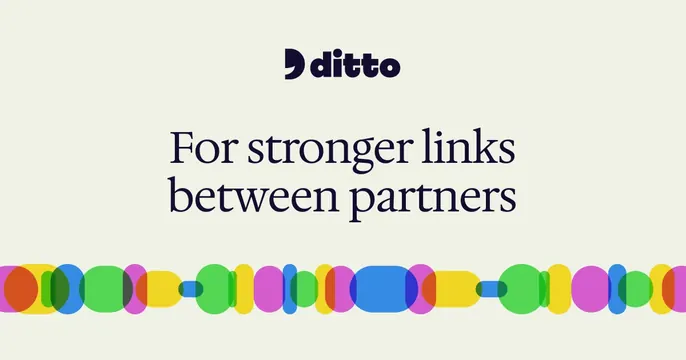
Cream card with a centered "ditto" wordmark, a serif headline "For stronger links between partners" and a colorful overlapping-dots chain band across the bottom.
Summary
A calm cream card stacking a small "ditto" wordmark, a dark serif headline about partner links, and a vivid horizontal chain of overlapping translucent dots along the bottom.
Visual description
Warm off-white background. Centered near the top is the "ditto" wordmark in a dark navy rounded sans with a small comma-like mark. Below it, a two-line serif headline in the same navy reads "For stronger links between partners." Running full width across the bottom is an illustrated chain made of overlapping circles and capsules in green, yellow, magenta, blue and orange, the translucent shapes blending where they cross to suggest interlocked links. The composition is tidy and centered with generous breathing room.
Key takeaway
The bottom band of overlapping multicolor dots literally illustrates the "links between partners" idea while staying abstract, so it doubles as decoration and metaphor. Pairing a serif headline with a soft sans wordmark feels editorial and trustworthy.
Reuse notes
Suits a B2B or fintech brand built on connections, partnerships or networks. The chain motif is the signature; keep the rest minimal so it reads. Works on a warm neutral; the translucent overlap effect needs a plain field to stay clean.