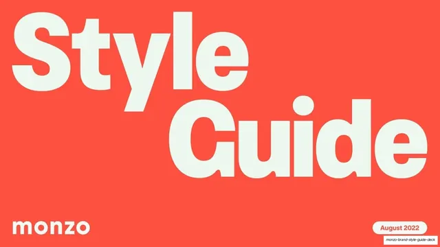
Preview image. Unlock full-res
An 82-slide Monzo brand style guide built on hot coral, with oversized grotesque headlines, pale-mint section dividers, and real product mockups demonstrating every logo, colour and usage rule.
Summary
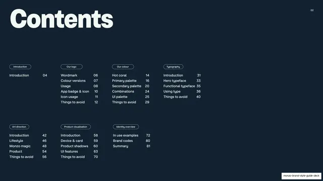
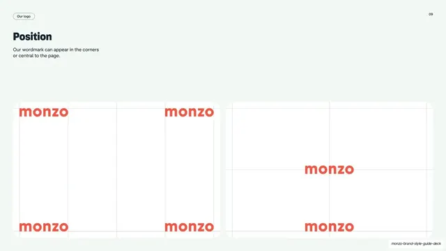
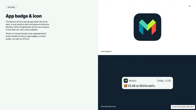
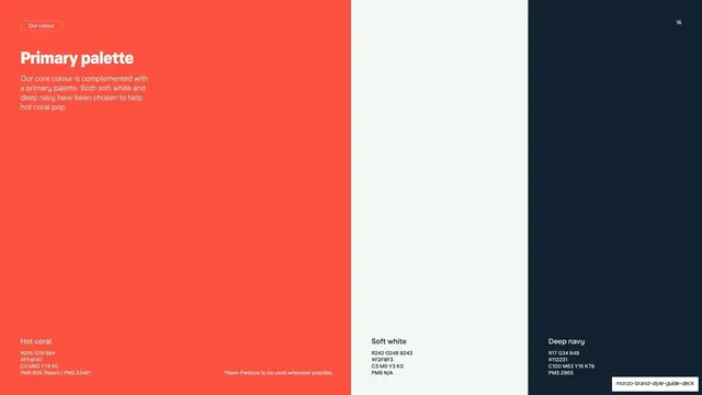
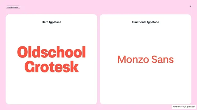
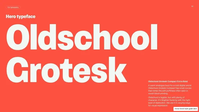
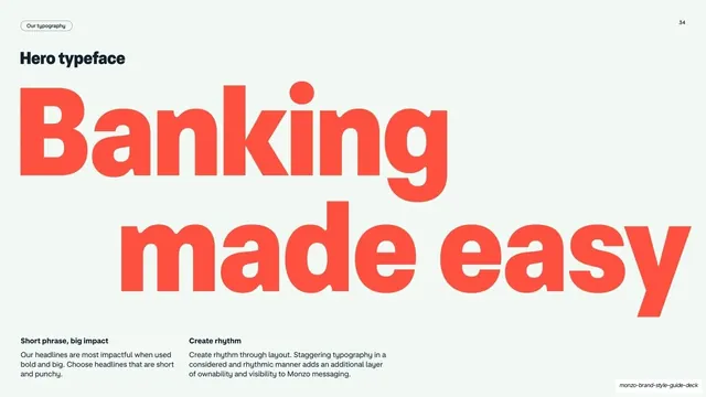
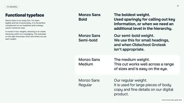
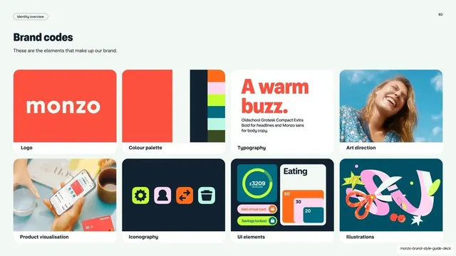
The Monzo brand style guide, dated August 2022, for the UK digital bank. Across 82 slides it documents the hot-coral-led identity: the wordmark and its colourways, the multicolour M app icon, the three-colour primary palette, type, art direction, product visualisation and an identity overview. Its personality comes from three moves: hot coral as a dominant signature colour, oversized heavy grotesque headlines, and pale-mint section dividers that chapter the deck.
Visual description
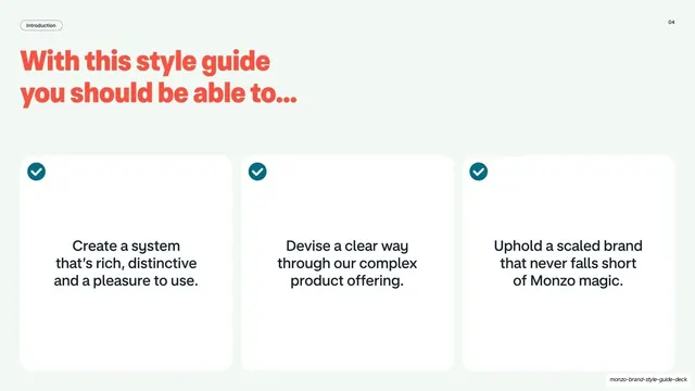
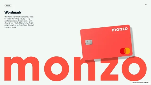
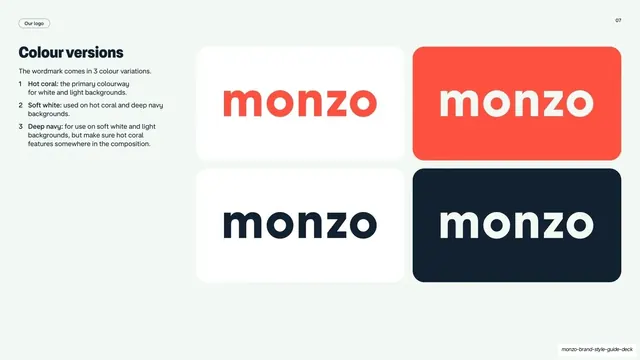
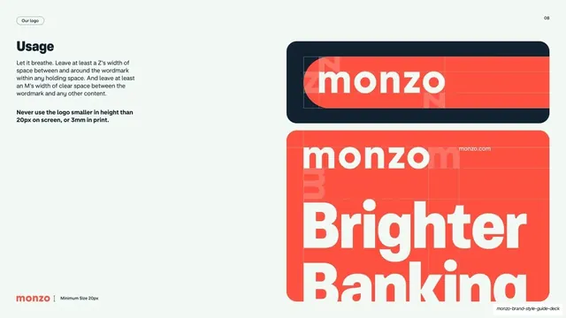
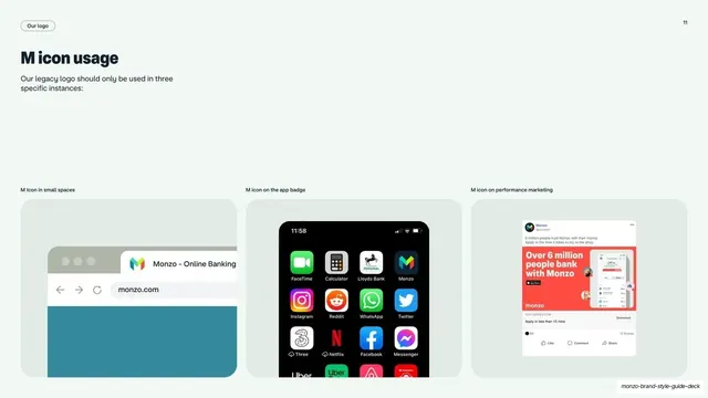
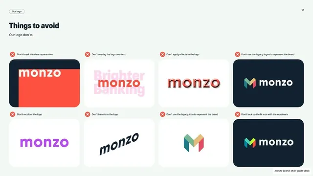
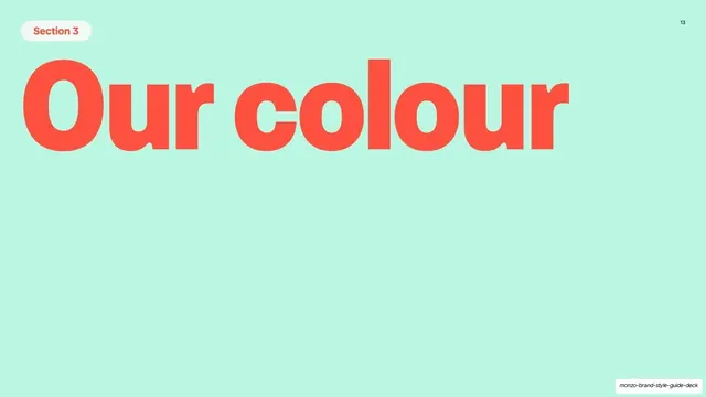
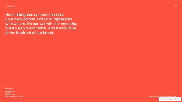
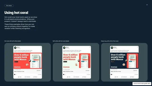
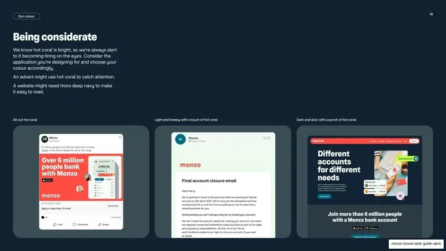
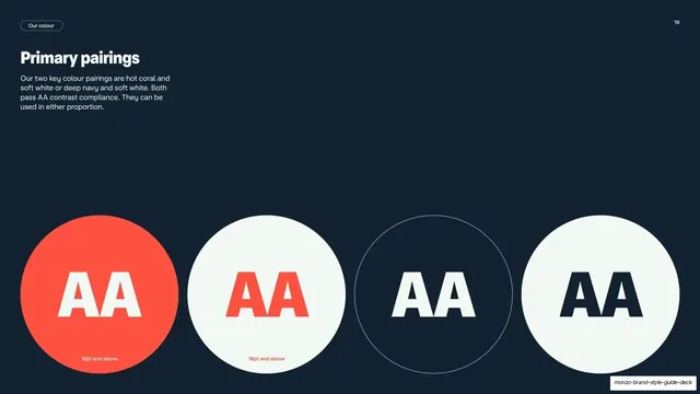
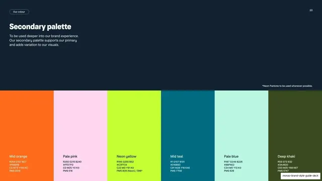
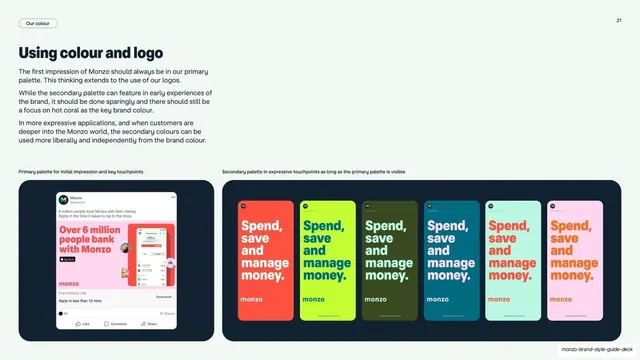
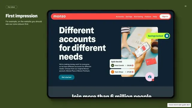
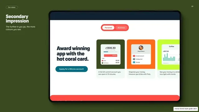
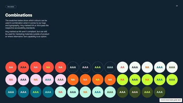
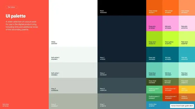
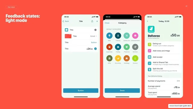
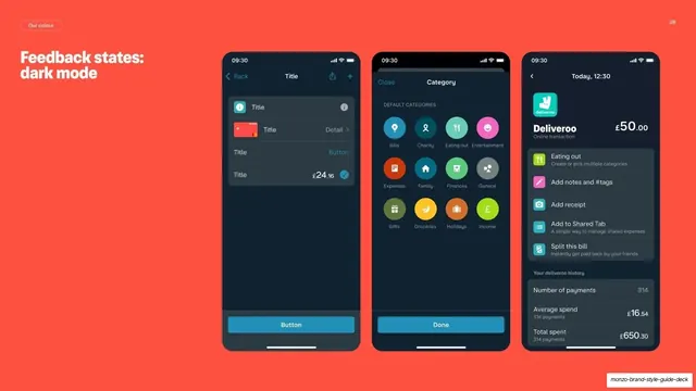
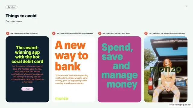
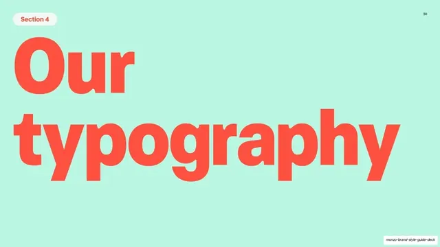
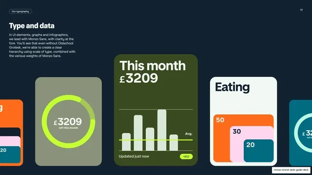
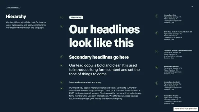
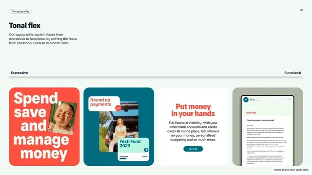
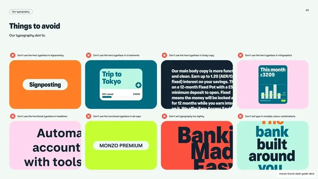
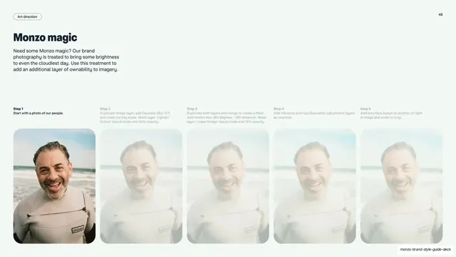
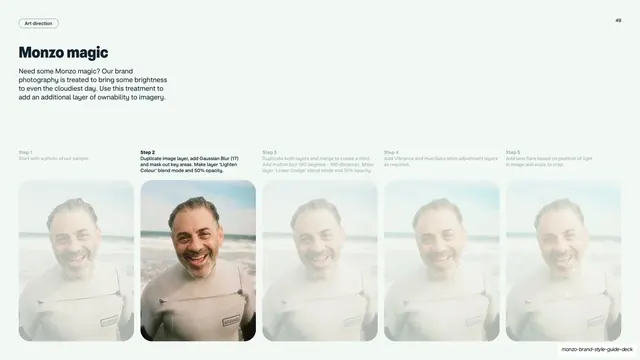
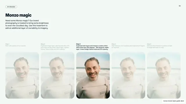
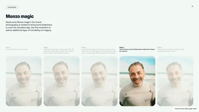
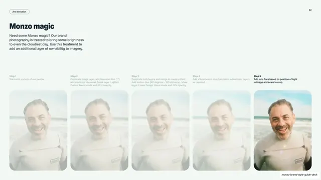
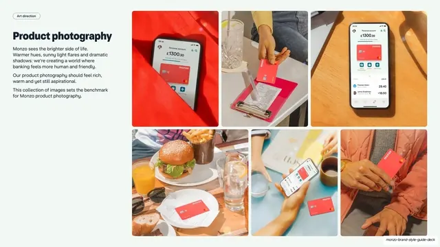
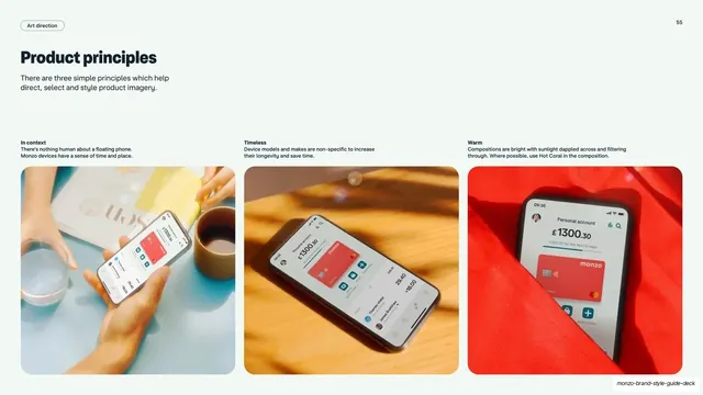
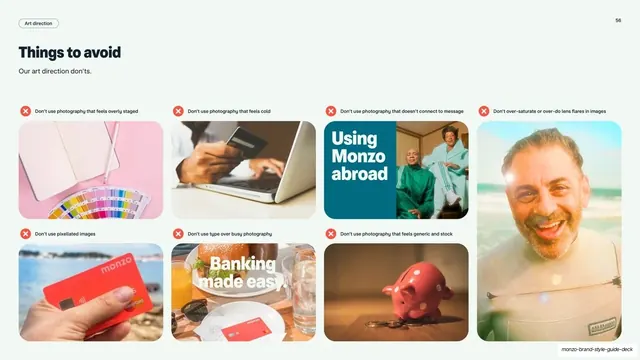
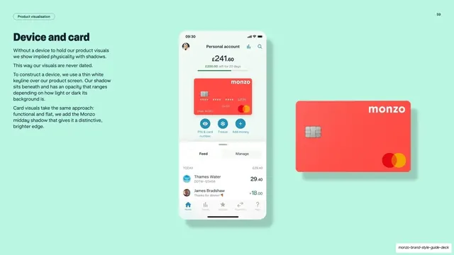
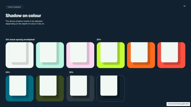
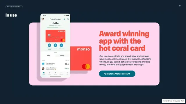
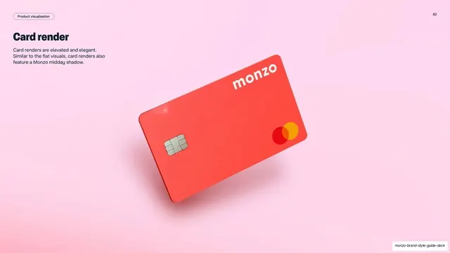
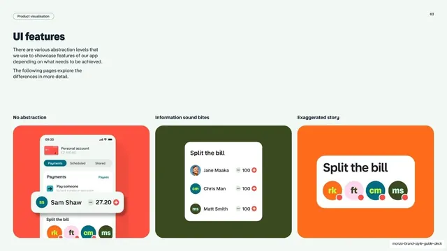
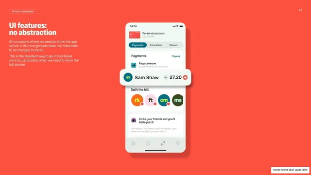
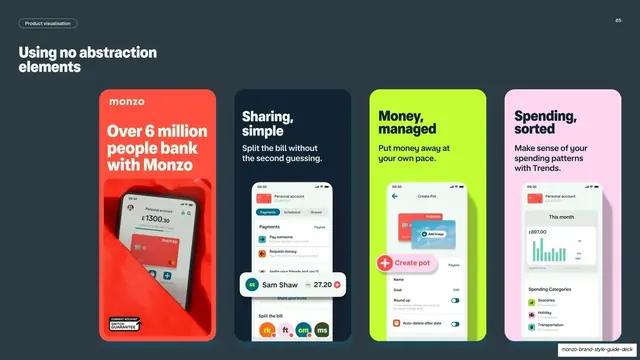
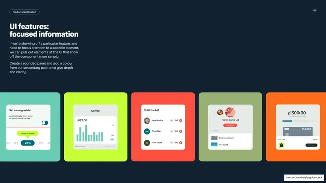
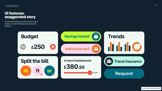
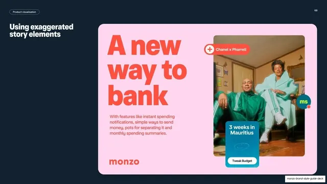
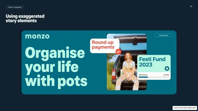
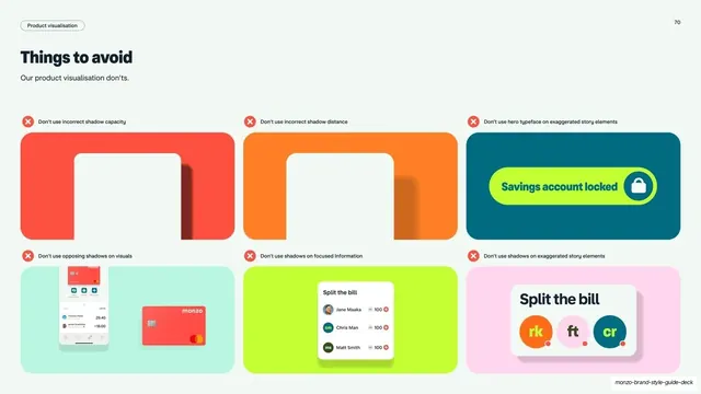
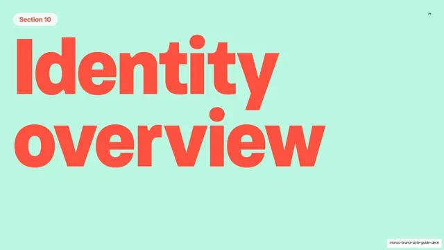
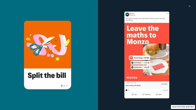
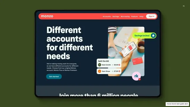
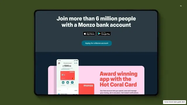
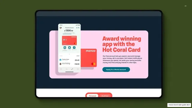
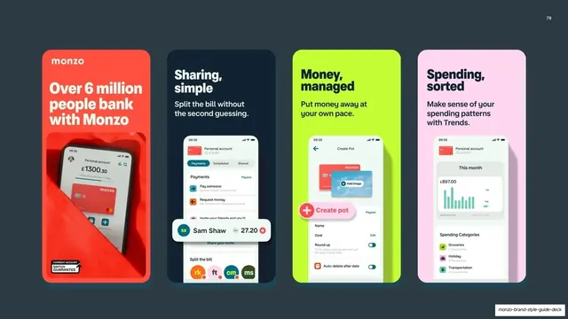
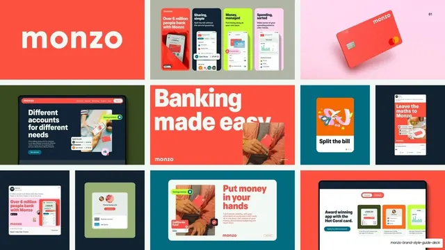
Slides run 16:9 on a tight three-colour core: hot coral (#FF4F40), soft white (#F2F8F3) and deep navy (#112231), with a recurring pale-mint divider ground (roughly #BFF2DD) and a teal accent (#147D86) used for check icons. Headlines are set in a heavy geometric grotesque, often oversized to fill or bleed off the frame; body copy is a lighter humanist sans. A consistent utility system runs throughout: a small outlined or filled rounded pill in the top-left names the current section ("Our logo", "Our colour", "Section 2"), and a two-digit page number sits top-right. Recurring layouts include: full-bleed colour reveals with a giant word bleeding off the bottom and a tilted product card floating over it; pale-mint "Section N" dividers carrying one oversized hot-coral phrase; split content slides with a heading and copy left and a diagram, swatch grid or mockup right; three-up and 4x2 card grids for objectives, usage examples and "things to avoid" don'ts (each flagged with a coral X); and full-height colour-panel pages keyed with complete RGB/hex/CMYK/Pantone specs. Real product mockups, the hot-coral debit card, app tiles, push notifications, social ads, emails, web promos, do most of the demonstrating rather than abstract swatches.
Key takeaway
Letting a single signature colour dominate the whole system, including full-bleed colour-reveal slides where the page literally is the colour it names. The repeated pale-mint section dividers that chapter a long guide with zero new layout. And the discipline of proving every rule with a realistic in-context mockup (favicon, app badge, ad, email) instead of describing it, so each guideline is unmistakable.
Reuse notes
A strong reference for brand and visual-identity guideline decks, especially for fintech or consumer-app brands organized around one hero colour. The recurring grammar, oversized grotesque headline, top-left section pill, top-right page number, mint divider, mockup-led rule pages, is directly reusable as a template for a multi-section guide. Needs a genuinely distinctive brand colour and clean product photography to carry the full-bleed and floating-card treatments; the loud coral is tempered by the guide's own "be considerate" rule, worth keeping if you adopt the approach.
From this deck: Monzo Brand Style Guide 2022
View deck















More like this



Keep what you find
A free account saves references to boards and can send you a weekly email of picks based on what you save.
To see every result, go Pro.