Preview image. Unlock full-res
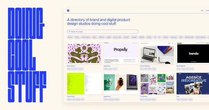
Cream card split between a giant blue condensed "DOING COOL STUFF" vertical title on the left and a screenshot of a studio-directory grid on the right.
Summary
A cream card split into a towering condensed-blue title stacked vertically on the left and a live screenshot of the studio-directory product on the right.
Visual description
Warm cream background. The left third holds "DOING COOL STUFF" set in a tall, ultra-condensed electric-blue sans, stacked as three left-aligned lines that nearly fill the height. The right two-thirds is a product screenshot: a small DCS logo top-left, "Info" and "Contact" top-right, the heading "A directory of brand and digital product design studios doing cool stuff," a search field, a row of pill filter tags (Brand, Digital, sizes, regions), then a grid of studio preview cards (Studio Bruch, uppercase, Formal Settings, Banda Agency and more) each with a thumbnail and tags. The screenshot bleeds off the right edge.
Key takeaway
The oversized vertical condensed wordmark turns the brand name into a graphic spine, contrasting hard with the calm UI screenshot beside it. Letting the product screenshot bleed off-canvas implies a fuller page.
Reuse notes
Strong for a directory, gallery or agency whose product is a curated grid. The condensed-type column needs height to work; the visible screenshot rows should be the most representative. Bold but neutral, easy to reskin to other brand colors.