Preview image. Unlock full-res
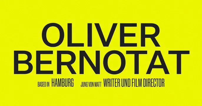
Editorial personal-brand OG card stacking a huge all-caps name over small role and location credits on a lime-yellow field.
Summary
A personal-brand card that makes the name itself the entire graphic: "OLIVER BERNOTAT" set huge over two lines, with a single line of small caps beneath for role and location.
Visual description
A flat lime-yellow background holds a two-line, all-caps name in a bold near-black grotesque, set tight and large enough to nearly span the full width. Below it a single small caps line reads "BASED IN HAMBURG JUNG VON MATT WRITER UND FILM DIRECTOR," mixing lighter and heavier weights to separate label from value. Generous yellow margins frame the block; no imagery or logo.
Key takeaway
Treating the name as the hero with a confident type-only layout. The trick of weight-contrast in the credit line (light "BASED IN" against bold "HAMBURG") packs role, agency, and city into one tidy strip without dividers.
Reuse notes
Ideal for a writer, director, or creative whose name is the brand. The acid yellow gives a stylish, art-directed feel; pair with a serious sans for credibility. Works only when the name is short enough to stay legible at two lines.
More like this









Keep what you find
A free account saves references to boards and can send you a weekly email of picks based on what you save.
To see every result, go Pro.