Preview image. Unlock full-res
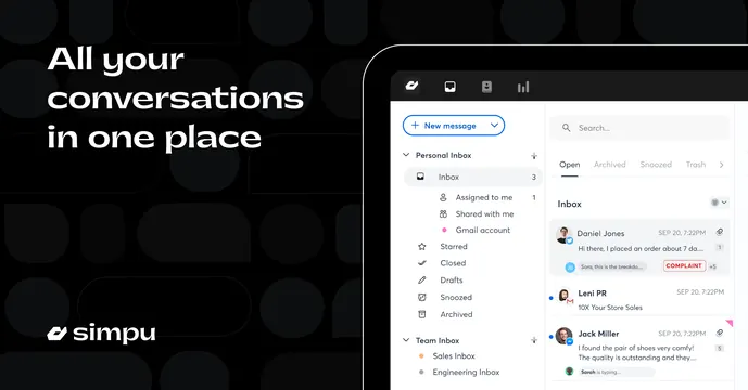
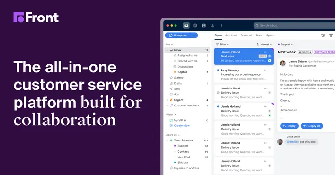
Split OG card on deep purple with a bold left-aligned headline and a detailed shared-inbox product screenshot filling the right side.
Summary
A two-column OG card on deep purple: marketing headline on the left, a full shared-inbox app screenshot on the right. The defining move is pairing a bold value-proposition headline directly against a busy, real product view.
Visual description
Deep violet-purple background. Top-left carries the white Front logo (a small mark plus "Front" wordmark). Below it, a left-aligned multi-line headline in white sans-serif reads "The all-in-one customer service platform built for collaboration," mixing bold and lighter weights for emphasis. The right roughly two-thirds is a detailed screenshot of the Front shared inbox: a folder sidebar, a message list with avatars and labels, and an open email thread with reply buttons. The dense UI contrasts with the flat purple.
Key takeaway
The clean split between persuasive copy on a solid brand color and a genuinely detailed product screenshot on the other side, plus mixing two type weights within one headline to stress the key phrase.
Reuse notes
Good for a B2B SaaS that wants to show its actual interface and is confident the UI looks polished at small sizes. Pairs well with collaboration and support tools. The screenshot must hold up scaled down in a social feed; very dense UIs can turn to mush.