Preview image. Unlock full-res
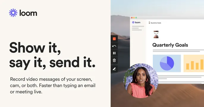
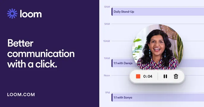
Deep-purple left panel with the Loom logo and "Better communication with a click." headline, beside a light calendar UI with a webcam bubble and recording controls.
Summary
A second Loom card on a deep-purple panel: logo, a two-line white headline and a URL on the left, with a light calendar interface, a webcam bubble and a recording-control pill on the right.
Visual description
The left two-fifths is a solid dark purple field holding the white Loom logo and wordmark up top, "Better communication with a click." in a bold white sans across three lines, and "LOOM.COM" anchored at the bottom. The right side shows a light day-calendar (8AM to 1PM with events like Daily Stand-Up, 1:1 with Dereje, 1:1 with Sonya) in lavender event bars, a large circular webcam bubble of a smiling woman, and a floating recording-control pill reading a red stop, "0:04", pause and trash. It stages the product mid-recording.
Key takeaway
The branded color block as the left panel (vs cream in the sibling card) shows how the same split template flexes by swapping the background. The floating record pill plus webcam bubble are the instantly readable "you are recording" cues.
Reuse notes
Same dependable split-card structure for a SaaS tool, tuned darker and more branded. Good when you want the brand color to dominate; keep the right-side UI light so the product reads clearly against the saturated panel.