Preview image. Unlock full-res
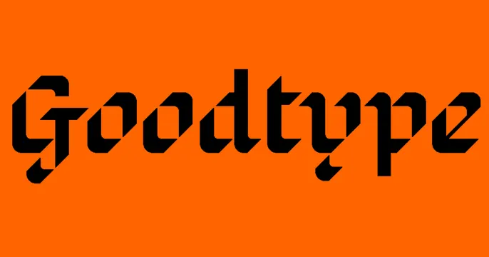
Bold minimal OG card with a single black blackletter-style "Goodtype" wordmark centered on a flat bright-orange field.
Summary
A flat bright-orange card carrying only a single black custom-lettered "Goodtype" wordmark across the center. The defining move is letting one expressive piece of lettering be the entire design.
Visual description
Solid bright-orange background with no texture or imagery. Centered and spanning most of the width is the word "Goodtype" drawn in a black, faceted blackletter-meets-modern display style, with sharp angular cuts and beveled strokes that give the letters a carved, custom feel. The descender of the "g" and the spurs on the letters add character. Nothing else appears: no tagline, icon, or border.
Key takeaway
For a lettering or type brand, making the wordmark itself the hero proves the craft instantly: the logo is the portfolio. A single saturated background color makes the custom type pop with zero distraction.
Reuse notes
Ideal for type foundries, lettering artists, or design studios whose value is typographic skill. Only works when the wordmark is genuinely distinctive. The bare, copy-free approach assumes the audience already knows or will click to learn more.