Preview image. Unlock full-res
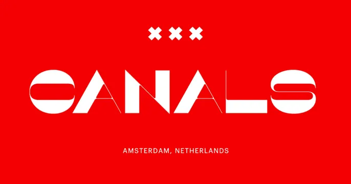
Bold red OG card with an oversized stencil-cut "CANALS" wordmark centered, the three Amsterdam crosses above and a location line below.
Summary
A two-tone red-and-white OG card built entirely from type: a huge stencil-style "CANALS" wordmark centered, crowned by the three Amsterdam X crosses and footed by a small location caption.
Visual description
Flat saturated red fills the frame. Centered at the top are three white X marks (the Amsterdam flag motif) in a tight row. Dominating the middle is an oversized white display wordmark, "CANALS," drawn in a custom stencil-cut style where letters are sliced by angled negative-space gaps, giving an architectural, almost folded look. Centered near the bottom, small white all-caps letter-spaced text reads "AMSTERDAM, NETHERLANDS." No imagery, gradients, or product; the entire card is the two-tone type composition.
Key takeaway
Letting one giant custom-cut wordmark carry the whole card on a single flat color is fearless and instantly memorable. The stencil slices add craft and motion to otherwise static type, and the city crosses plus caption anchor the identity without clutter.
Reuse notes
Reach for this when the brand name itself is the hero and you have a distinctive type treatment to show off. Works for studios, places, or events. Needs a genuinely custom or characterful typeface; in a default font it would fall flat. High-impact at any thumbnail size.