Preview image. Unlock full-res
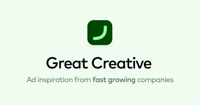
Minimal mint-green OG card with a centered rounded-square smile icon above the Great Creative wordmark and a one-line tagline.
Summary
A soft mint-green card with a rounded-square smile app icon centered above the "Great Creative" wordmark and a single descriptive tagline. The defining move is the calm, perfectly centered logo lockup in lots of whitespace.
Visual description
Pale mint-green background with generous empty space. Centered near the top sits a dark-green rounded-square app icon containing a single light-green upward-curved stroke that reads as a smile. Below it, "Great Creative" appears in a clean black geometric sans, and beneath that a smaller dark-green tagline reads "Ad inspiration from fast growing companies," with "fast growing" bolded. The layout is symmetric and uncluttered.
Key takeaway
A vertically stacked, centered lockup (icon, name, one tagline) on a single soft brand color is a clean, reliable formula for a product that wants to feel approachable and modern. Bolding two words in the tagline adds emphasis without extra design.
Reuse notes
Good default for an app, gallery, or agency product that wants a tidy, friendly card. The whitespace and soft color read calm and premium. Because it leans on the app icon, it works best when that mark is distinctive on its own.
More like this


Keep what you find
A free account saves references to boards and can send you a weekly email of picks based on what you save.
To see every result, go Pro.