Preview image. Unlock full-res
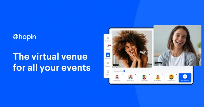
Left-aligned wordmark and tagline on a blue field beside a floating product UI mockup of a virtual event session.
Summary
A two-part card: brand wordmark and a large headline on a solid blue panel at left, a floating screenshot of the virtual-event product UI at right. The headline states the value proposition directly.
Visual description
A saturated royal-blue background, slightly lighter in a soft radial sweep on the right. Top left, the white Hopin wordmark with its pinwheel mark. Below it, an oversized two-line white headline reads "The virtual venue for all your events." The right half shows a tablet-framed product screenshot of an event session: a left nav rail (Reception, Stage, Sessions, Network, Expo), two large smiling video tiles of attendees, and a row of small circular speaker avatars with a blue "Add to stream" button. The mockup floats without a hard container, tilted slightly into frame.
Key takeaway
The clean split of a solid brand-color message panel against a single floating product shot. One loud headline plus a real UI screenshot communicates the category instantly without clutter.
Reuse notes
Strong default for a SaaS product whose UI is recognizable and attractive. Works best when the brand color is bold enough to fill half the card. Needs a clean, legible product screenshot to carry the right side.