Preview image. Unlock full-res
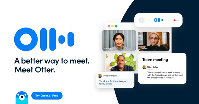
Split OG card with an oversized blue Otter logo and tagline at left and a stacked transcription-app UI mockup at right.
Summary
A two-panel OG card pairing a large bright-blue Otter logo and the line "A better way to meet. Meet Otter." with a floating cluster of meeting and transcription UI cards.
Visual description
Left half is white with the oversized blue Otter mark (circle plus three bars) at top, a dark navy two-line headline "A better way to meet. Meet Otter." below, and a small blue otter mascot beside a blue "Try Otter.ai Free" pill button at the bottom. The right half sits over a dark navy quarter-circle arc and stacks several rounded UI cards: a recording-bar header with timestamp, a grid of video-call participant tiles with photographed faces and name labels (Charlie, Madison, Brian), a chat bubble from "Bradley Meyer", and a "Team meeting" note panel with an avatar and transcribed text.
Key takeaway
The clean split of brand at left, product-in-action at right, with the dark arc giving the floating UI cards a stage and depth. The mascot tucked beside the CTA adds personality without clutter.
Reuse notes
A reliable template for SaaS and AI productivity tools that want to show the interface while keeping a strong brand and a clear CTA. Needs a tidy, realistic UI mockup to fill the right side. Crops well because all the meaning lives on the left.