Preview image. Unlock full-res
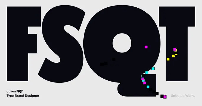
Brutalist card with giant near-black FSQT letters spilling scattered CMYK pixel squares against a light gray field.
Summary
A type-forward portfolio card where four colossal letters FSQT fill the frame and shed a trail of CMYK pixel squares, signaling a designer who plays with letterforms.
Visual description
Light gray background dominated by FSQT in a heavy near-black geometric sans, the letters so large they crop hard against the top and side edges. From the Q and lower-right area a loose diagonal trail of small squares scatters down and right, colored magenta, cyan, yellow, and solid black, like dropped pixels or CMYK confetti. Bottom-left holds small black text "Julien FSQT / Type Brand Designer" stacked in two lines with key words bolded. Bottom-right shows "Selected Works" in light gray, low-contrast. The composition is otherwise empty, letting the type and the pixel spray do the work.
Key takeaway
Crop oversized display letters past the edges so they read as texture, then break the rigid grid with a playful scatter of small colored squares for energy. The CMYK palette quietly nods to print and type craft.
Reuse notes
Good for a type designer, print studio, or any portfolio that wants a loud, experimental cover. The scattered squares are the personality; keep them sparse so they feel intentional, not noisy. Light background keeps the black letters maximally legible at thumbnail size.
More like this








Keep what you find
A free account saves references to boards and can send you a weekly email of picks based on what you save.
To see every result, go Pro.