Preview image. Unlock full-res
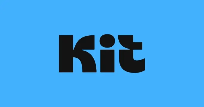
Minimal card with a single chunky black lowercase Kit wordmark centered on a bright sky-blue field.
Summary
A pure brand card: one chunky lowercase "kit" wordmark in black, centered on a flat bright blue background with nothing else.
Visual description
A single flat sky-blue field fills the frame. Dead center sits the word "kit" in a heavy black lowercase display sans with soft rounded terminals and a tall round dot on the i. The letters are large but leave wide blue margins on all sides. There is no tagline, URL, icon, or imagery. The contrast of black mark on saturated blue is the entire composition.
Key takeaway
When a brand has a strong, friendly wordmark, an OG card can be nothing but the logo on a single brand color, sized generously with breathing room. The rounded heavy type carries warmth so it does not feel cold or empty.
Reuse notes
Best when the wordmark alone is recognizable and you want maximum brand consistency across shares. Trade-off: it communicates no value proposition, so it suits established brands more than new ones. Any saturated brand color works as long as the mark has high contrast against it.