Preview image. Unlock full-res
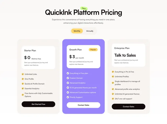
Light three-column pricing section with a billing toggle and a saturated purple middle plan lifted above the two neutral cards.
Summary
A light three-column pricing section with a Monthly/Annually toggle and a vivid purple middle plan that is taller and color-filled to mark it as recommended. Standard tiered layout executed with a playful color accent.
Visual description
A large display headline "QuickInk Platform Pricing" carries a small green "Plans" sticker, with two centered lines of grey sub-copy and a pill toggle ("Monthly" active in yellow / "Annually") beneath. Three pricing columns follow on a warm off-white background. The outer two (Starter Plan $0 lifetime free, Enterprise Plan "Talk to Sales") sit in pale beige cards with a white inner panel for plan name and price, a yellow-bulleted feature checklist, and a dark pill CTA. The middle Growth Plan is wrapped in a saturated purple card, lifted taller than its neighbors, with a yellow "Popular" badge, a white inner price panel ($3 per month), a white-check feature list on purple, and a white "Contact Sales" button. Checkmarks use rounded yellow badges throughout.
Key takeaway
The recommended plan rendered as a full purple block that is both taller and color-inverted, so it wins attention without a loud banner. The nested white inner panel holding the price inside each card creates a clean two-layer hierarchy (frame vs. price). A yellow-bullet checklist keeps the feature lists scannable and on-brand.
Reuse notes
A dependable default for a three-tier SaaS with a clear middle "best value" plan. The billing toggle implies a monthly/annual swap, so wire it up or it reads as decorative. The bright palette suits consumer and creator tools; for enterprise, swap the saturated highlight for a subtler tint. Outer plans intentionally read quieter, which is the point.