Preview image. Unlock full-res
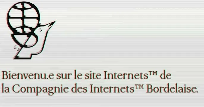
Retro low-fi card with a chromatic-aberration globe-and-pen emblem above a French welcome line set in a serif, on a scanline gray field.
Summary
A deliberately low-fi retro card: a chromatic-aberration globe-and-fountain-pen emblem sits above a two-line French welcome message in a serif, all over a faint scanline gray.
Visual description
A light warm-gray background carries subtle horizontal scanlines like an old CRT or fax. Top-left holds a black emblem combining a gridded globe with a fountain-pen nib, printed with a slight red-cyan chromatic aberration that gives it a misregistered, photocopied look. Below it, left-aligned, two lines of dark serif text read "Bienvenu.e sur le site Internets(TM) de la Compagnie des Internets(TM) Bordelaise." with trademark symbols, the dot-e an inclusive-French spelling. The right side of the card is mostly empty gray. The whole thing feels intentionally vintage, ironic, and analog.
Key takeaway
Add slight chromatic aberration and scanlines to a clean emblem to fake a photocopied, early-web nostalgia without redrawing anything. Pairing that with a courteous serif welcome line and visible trademark symbols sells a knowing, retro-ironic tone.
Reuse notes
Fits an agency, studio, or media brand leaning into retro-web or anti-slick irony. The effect reads as a choice only when the underlying mark and type are otherwise crisp; overdone, it just looks broken. Copy here is in French with inclusive spelling.
More like this




Keep what you find
A free account saves references to boards and can send you a weekly email of picks based on what you save.
To see every result, go Pro.