Preview image. Unlock full-res
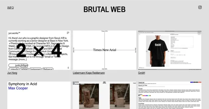
Light-gray OG card laid out like a gallery index page: a centered serif title, a small INFO link, an Instagram icon, and a grid of project thumbnails.
Summary
The share card reproduces the site itself: a light-gray gallery index with the serif title "BRUTAL WEB" centered at top, an INFO link at left, an Instagram glyph at right, and a grid of captioned project screenshots below.
Visual description
On a flat light-gray background, "BRUTAL WEB" is centered at the top in a black serif. Top-left is an underlined "INFO" link; top-right is a small Instagram icon. Below sits a grid of website thumbnails, each a small screenshot with a black underlined caption (for example "Jun Hong," "Liebermann Kiepe Reddemann," "GmbH," "Symphony in Acid / Max Cooper"). The thumbnails vary (text-heavy portfolios, a model in a black tee, abstract sculptures, a trend-list directory), giving a dense, editorial, almost system-page feel. The whole thing reads as a screenshot of a curated directory.
Key takeaway
Using a literal screenshot of the product (a directory of sites) as the OG card tells the viewer exactly what they will get. The brutalist mix of a serif title, plain nav links, and a raw thumbnail grid signals an indie, design-curation feel.
Reuse notes
Fits a gallery, directory, or curation site where the content grid is the value proposition. Works on light. Caveat: thumbnail captions are tiny and unreadable at share size, so the title and overall texture carry recognition rather than any specific entry.
More like this







Keep what you find
A free account saves references to boards and can send you a weekly email of picks based on what you save.
To see every result, go Pro.