Preview image. Unlock full-res
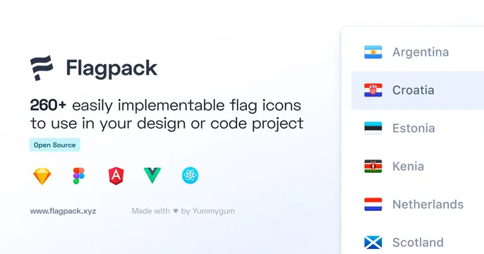
Light OG card for a flag-icon library: logo, "Flagpack" wordmark and a "260+ flag icons" line at left, a flag list dropdown and tool logos at right.
Summary
A clean light card for a flag-icon set: the Flagpack logo, wordmark, a "260+ easily implementable flag icons" line, an Open Source badge and tool logos at left, with a flag-list dropdown previewing the icons at right.
Visual description
On a very light blue-white gradient, the left side stacks the dark Flagpack flag-glyph logo and wordmark, the line "260+ easily implementable flag icons to use in your design or code project" in dark sans-serif (with "260+" bold), a small tinted "Open Source" badge, a row of platform logos (Sketch, Figma, Angular, Vue, React), and the URL "www.flagpack.xyz" beside "Made with love by Yummygum". The right side shows a white rounded dropdown panel listing countries (Argentina, Croatia highlighted, Estonia, Kenia, Netherlands, Scotland) each with its flag icon, demonstrating the product in a realistic UI control.
Key takeaway
Demonstrating an icon or asset library by showing the icons inside a believable UI element (here a country dropdown), which proves the product in use rather than just describing it. The row of platform logos quickly communicates compatibility and reach.
Reuse notes
A strong template for developer tools, icon packs, or component libraries. The left-info / right-UI split keeps the value prop and the live demo both clear. Including framework logos and an open-source badge signals audience and licensing at a glance. Keep the demo control simple so the icons remain the focus.