Preview image. Unlock full-res
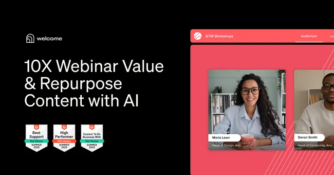
Split OG card with a dark left panel carrying a white headline and G2 award badges, and a coral right panel showing a webinar product UI with presenter tiles.
Summary
A two-panel OG card: a black left half with logo, a benefit headline, and a row of G2 award badges, against a coral right half showing the live webinar product with two presenter video tiles. It stacks social proof and product in one frame.
Visual description
The card is split. The left panel is near-black: the "welcome" logo and wordmark at top, a three-line white sans-serif headline "10X Webinar Value & Repurpose Content with AI", and a row of three colorful G2 medal badges ("Best Support", "High Performer", "Easiest To Do Business With", Summer 2025) along the bottom. The right panel is coral red and frames a webinar interface labeled "GTM Workshops / Auditorium", with two rounded video tiles of presenters captioned "Maria Leon" and "Deron Smith" and their roles.
Key takeaway
Combining three signals in one card: a benefit headline, a row of third-party award badges for credibility, and a real product screenshot. The hard split between a dark info panel and a bright product panel keeps all three legible.
Reuse notes
Strong for B2B SaaS in a competitive category where awards and proof matter. The badge row is the reusable idea: it borrows credibility cheaply. Keep the badges small and aligned so they read as a trust strip, not clutter. The split layout needs a clear color break between halves.