Preview image. Unlock full-res
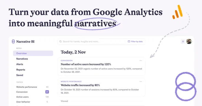
Light OG card with a serif headline and hand-drawn circle annotation above a Narrative BI dashboard screenshot, accented by the Google Analytics mark.
Summary
A light Narrative BI OG card stacking a serif headline with a hand-drawn circle annotation over a flat dashboard screenshot, with the Google Analytics bars and a dashed arrow tying them together. The doodled annotation and GA mark define it.
Visual description
Off-white background. The top carries a large two-line dark-navy serif headline "Turn your data from Google Analytics into meaningful narratives", with the word "narratives" lassoed by a rough purple hand-drawn ellipse. The Google Analytics orange-bar icon sits top-right, and a grey dashed hand-drawn arrow curves down from it into the screenshot. Below, a flat front-on capture of the Narrative BI app shows a left menu (Overview, Narratives, Alerts, Reports, Saved), a search bar, and dated insight cards ("Number of active users increased by 120%", "Website traffic increased by 80%"). A purple double-ring doodle sits bottom-right.
Key takeaway
Hand-drawn marker annotations, a circled keyword, a dashed connector arrow, and loose ring doodles, layered over a clean serif headline and flat UI, add a human, explanatory touch that softens a data product. Borrowing the source platform's logo (GA) signals the integration instantly.
Reuse notes
Best for an analytics or integration tool that wants to feel approachable rather than corporate. The doodles must stay sparse and intentional or they look messy. Pairs the serif headline with a flat front-on screenshot; keep the background light so the navy type and purple marks read clearly.