Preview image. Unlock full-res
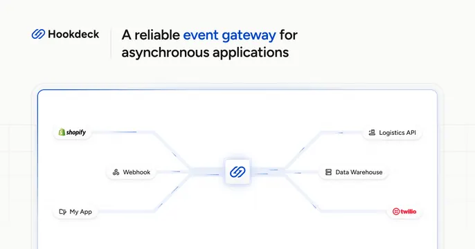
Light OG card with a logo-plus-headline header and a clean event-gateway diagram routing source logos through a central hub to destination services.
Summary
A light card with a logo-and-headline top bar and a tidy architecture diagram below showing events flowing from source apps through a central Hookdeck hub out to destinations. The defining feature is the symmetric node-graph that visualizes the product's job.
Visual description
Off-white background. The header row places the Hookdeck logo and wordmark at left, a thin vertical divider, then a two-line headline "A reliable event gateway for asynchronous applications" with "event gateway" highlighted in blue. Below sits a rounded card containing a left-to-right flow diagram on a faint dot grid: source pills (Shopify, Webhook, My App) on the left connect via curved blue traces into a central Hookdeck glyph, which fans out to destination pills (Logistics API, Data Warehouse, twilio) on the right. Clean blues and greys, generous spacing.
Key takeaway
Turning an abstract infrastructure value prop into a literal source-to-destination diagram so the product's role is instantly legible. Highlighting the key phrase in the headline with brand color to anchor the message.
Reuse notes
Good for developer infrastructure, integration, or middleware tools where the value is "we sit in the middle." Needs recognizable source/destination logos to land. The diagram is the payload; keep it symmetric and uncluttered.