Preview image. Unlock full-res
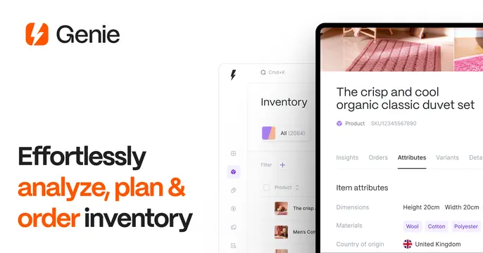
White OG card with an app-icon logo and a large four-line black headline on the left, and a tilted product UI panel bleeding in from the right.
Summary
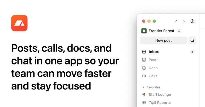
A white OG card that leads with a big four-line black headline beside the orange Campsite app icon, and anchors the right edge with a slightly tilted screenshot of the app's sidebar.
Visual description
White background. The left column holds the rounded-square orange app icon with its white mountain mark, then a four-line oversized near-black sans-serif headline, "Posts, calls, docs, and chat in one app so your team can move faster and stay focused." Bleeding in from the right is a corner of the product UI on a floating panel with a subtle drop shadow and a slight clockwise tilt: a "Frontier Forest" workspace switcher, a "New post" button and search field, then a nav list (Inbox with a 2 badge, Posts, Docs, Calls) and a Favorites group with emoji-tagged channels.
Key takeaway
Pairing a long, plain-spoken headline with a real tilted slice of the product UI lets the card sell both the message and the look of the app at once. The tilt and shadow make a flat screenshot feel like an object.
Reuse notes
Good when the value prop is a feature list and you have clean UI to show. Keep the screenshot cropped to one recognizable region so it stays legible small. Light-feed friendly; the headline carries it, so the UI can be decorative.