Preview image. Unlock full-res
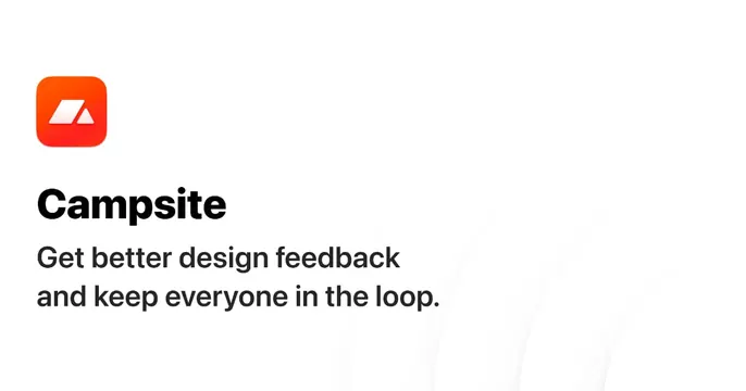
Clean white OG card with a rounded orange app-icon logo, bold black brand name, and a two-line value-prop subhead, left-aligned.
Summary
A bright, minimal white OG card that stacks a rounded orange app-icon, the bold "Campsite" name, and a two-line benefit line in the left half, with the right side left almost empty.
Visual description
Plain white background with very faint light-gray curved line graphics sweeping through the right side. Upper-left sits a rounded-square app icon in an orange gradient holding a white mountain-style mark. Below it, "Campsite" appears in heavy near-black sans-serif at large size, followed by a two-line dark-gray subhead, "Get better design feedback / and keep everyone in the loop." Everything is left-aligned and tightly stacked; the right two-thirds is open whitespace.
Key takeaway
The app-icon-as-logo lockup over a bold name and a short two-line promise is a fast, legible OG formula. The barely-there curved lines add a little texture without competing for attention.
Reuse notes
A safe default for a SaaS or productivity tool with a strong app icon. Works in light feeds and reads clearly at thumbnail size. The empty right side invites an optional product peek if you want more visual interest.
More like this





Keep what you find
A free account saves references to boards and can send you a weekly email of picks based on what you save.
To see every result, go Pro.