Preview image. Unlock full-res
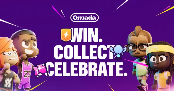
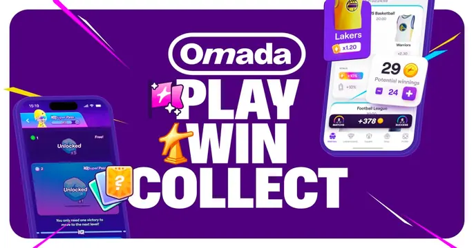
Playful gaming OG card pairing a stacked "PLAY. WIN. COLLECT." headline with tilted phone mockups of the app on a vibrant purple field.
Summary
A second Omada card swapping characters for product: a bold "PLAY. WIN. COLLECT." headline beside tilted phone mockups showing the app's game and wallet screens, on the same purple brand field.
Visual description
The vibrant purple background again carries neon pink and yellow confetti slashes. A white pill "Omada" logo sits top-center. The left and center hold a three-line all-caps headline, "PLAY." / "WIN." / "COLLECT.," each line tagged with a small game icon. To the right, two or three angled smartphone mockups display colorful in-app screens (a card game board and a rewards/wallet view with a "29" counter and badges). The layout reads as headline-left, devices-right, tightly packed with motion streaks.
Key takeaway
Reusing one brand background across a card set while swapping the right-side payload (here, device mockups instead of mascots) keeps a campaign cohesive. Tilted, overlapping phone screens quickly communicate "this is a polished mobile app."
Reuse notes
A strong template for promoting a mobile game or app where the UI is a selling point. Pairs naturally with its sibling character card for a series. Requires crisp, attractive app screenshots; the busy confetti and saturated purple keep it firmly playful, not enterprise.