Preview image. Unlock full-res
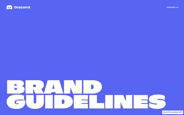
A 74-page Discord brand book built on full-bleed blurple, heavy all-caps condensed headlines that end in a period, and white-text-panel / dark-demo-panel spec spreads.
Summary
Discord's official 2021 brand book, organized into five numbered chapters (Introduction; Logo, Symbol, Wordmark and Tagline; Brand Colors; Typography; Brand in Use). Its personality comes from three repeated moves: saturated blurple as the default ground, oversized all-caps condensed headlines that almost always end in a period, and instructional spreads that pair a white left text panel against a dark right demo panel.
Visual description
Pages run 16:9. The signature color is Discord blurple (a periwinkle violet, #5865F2) used as a full-bleed background on covers, openers and statement pages. White is the standard type color on blurple. The secondary palette appears as whole-page grounds on the manifesto run: yellow, hot fuchsia pink and mint green, each carrying a single blurple all-caps statement. Near-black (#1E1F22) is the demo-panel and dark-mode ground. Type is a two-family system: a very heavy condensed-to-extended grotesque display cut (Ginto Nord) for headlines, set in tight all-caps and frequently closed with a period, and a clean humanist sans (Whitney) for body copy. Recurring layouts: full-bleed type-only statement pages centered or anchored low; section openers with a small all-caps "0X" stacked above an oversized chapter title; an INDEX page with five numbered columns of contents; two-column instructional spreads (white text panel left, dark panel right holding the logo, Clyde mascot, or rounded value cards); bento grids of large rounded squares; and the round Clyde mascot icon shown alone, in a 4-up usage matrix, and as a wall of expression variants. A persistent running header sits centered at the top of content pages ("0X CHAPTER / SUBSECTION"), with a tiny page number and a vertical "Discord Brand Guidelines" sidebar tag at the far left; pill-shaped "Download ... files" buttons sit bottom-left on spec pages.
Key takeaway
The discipline of one oversized all-caps headline per page, closed with a period, doing all the talking. The color-coded manifesto run, where each belief gets its own full-bleed brand color, paces the opening without any imagery. And the white-panel / dark-panel spread is a clean, reusable template for any "here is the rule, here is the demo" guideline page, letting the dark side carry assets and the light side carry the explanation.
Reuse notes
A strong reference for brand books, identity systems and any deck that has to stay loud and consistent across many pages. The numbered section-opener and two-panel spec templates transfer directly to product, design-system or playbook decks. The full-bleed single-color statement pattern works for manifestos and values sections. Depends on a heavy condensed display face and a confident single brand color to land; on a generic typeface the headlines lose their punch. The Clyde mascot grammar (alone, usage matrix, expression wall) is bespoke to Discord; swap in your own mark.
From this deck: Discord Brand Guidelines 2021
View deck









































































More like this









Keep what you find
A free account saves references to boards and can send you a weekly email of picks based on what you save.
To see every result, go Pro.