Preview image. Unlock full-res
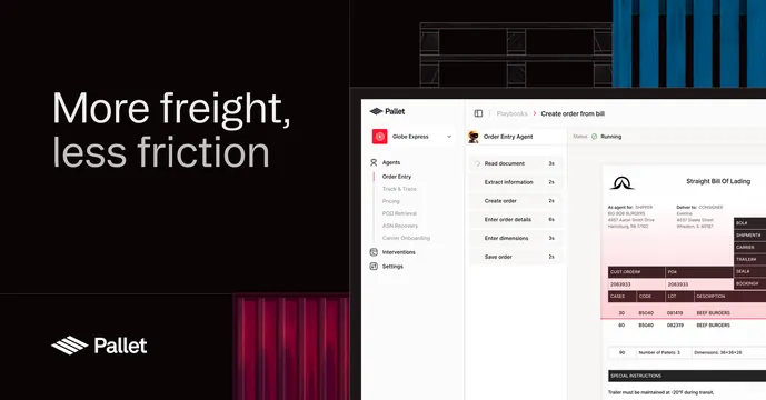
Dark split OG card with an oversized two-line headline on the left and a Pallet product UI screenshot on the right.
Summary
A dark, two-panel OG card pairing a quiet oversized headline on the left with a bright product UI screenshot on the right. The defining move is the editorial left/screenshot right split on pure black.
Visual description
The card is split into roughly a 40/60 left/right layout on a near-black background. On the left, a two-line headline "More freight, less friction" sits in oversized sans-serif, white on the first line and grey on the second, with the Pallet logomark and wordmark anchored at the bottom-left corner. Faint cropped images of shipping containers and red curtained freight peek in at the top-right and bottom-center edges. The right two-thirds shows a light-themed Pallet product screenshot: an order-entry agent panel with a left nav (Globe Express, Agents, Order Entry, Tracking), a task list with step counts, and a "Straight Bill Of Lading" document detail with a pink-highlighted data table.
Key takeaway
The clean editorial split that lets a product screenshot do the proof while the headline stays minimal. Using a grey second headline line for soft emphasis instead of a color accent. Container photography cropped to slivers at the edges to hint at the industry without clutter.
Reuse notes
Good for a B2B or logistics SaaS that wants to show real software in the share card. Needs a genuinely legible product screenshot, since it carries the larger half. The dark canvas keeps the bright UI panel feeling like a window; only works on dark.