Preview image. Unlock full-res
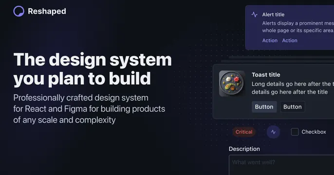
Dark split OG card with a white headline on the left and floating alert, toast, and checkbox UI components on the right.
Summary
A dark split card for a design system: a confident white headline on the left, with sample UI components (alert, toast, button, checkbox) floating as small cards on the right. Showing the components themselves is the point.
Visual description
On a near-black background, the left side holds the Reshaped logo and wordmark and the headline "The design system you plan to build" in white sans-serif over a smaller muted descriptive line. The right side floats several dark component cards: an "Alert title" block, a "Toast title" block with Button pairs, a "Critical" tag and a checkbox row, and a "Description" field, all rendered in the kit's own subdued dark styling so the OG card doubles as a component showcase.
Key takeaway
Using the product's actual UI primitives as the hero imagery, so a design-system OG card demonstrates itself. Floating the components as loose cards rather than inside a framed screenshot keeps it light.
Reuse notes
Purpose-built for a component library, design system, or UI framework. Only convincing if the components look polished, since they are the proof. Reads best on dark; the muted card edges would vanish on light.