Preview image. Unlock full-res
A 9-slide dark-mode sales deck for Linear that pairs oversized white headlines with violet section labels and product UI on a near-black gradient to pitch its issue tracker as the fast alternative to bloated tools.
Summary
A 9-slide dark sales deck for Linear pitching its issue tracker as the fast, well-designed alternative to bloated tools. Its whole personality comes from one disciplined system: a near-black background, one oversized white headline per slide, a small violet eyebrow label above it, and real product UI doing the demonstrating.
Visual description
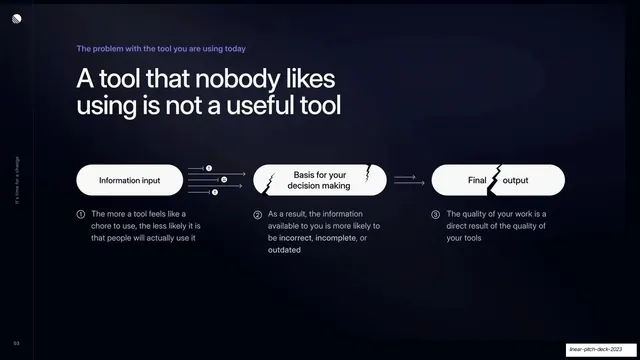
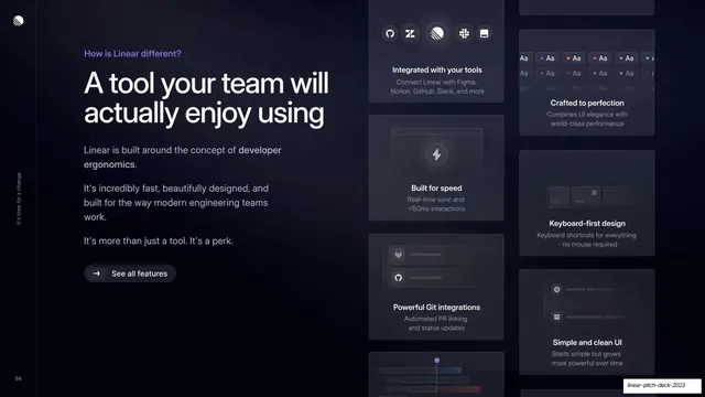
Slides run 16:9 on a near-black background (#0B0D17) with a faint cool radial gradient that lifts the upper area of each slide. The layout grammar is consistent: a small violet (#7C7CF0) eyebrow label ("What is Linear?", "How is Linear different?", "Switch to Linear"), then a two-line oversized white headline in a clean humanist sans, then supporting content below. The left margin carries a thin vertical rule with the running spine label "It's time for a change" rotated vertically, plus a small zero-padded page number ("01"..."08") in the bottom-left corner; the Linear monogram sits top-left on every slide. Content treatments rotate through the deck: a split text-left / product-screenshot-right intro; a three-column problem row with circular icons on a connecting hairline; a three-node "input to output" flow of white pill shapes (the later two cracked to signal breakage); a tall bento grid of dark feature cards mixing UI mockups and stat lines; a two-column benefits list with circular violet icons beside a quoted customer testimonial and logo (Vercel, Cash App, Watershed); a logo wall of customer brands (Ramp, Loom, Vercel, Descript, Cash App, Raycast, Mercury, Retool, Alan, Arc, OpenSea); and a closing two-card CTA with a violet gradient "Get started" button beside a ghost "Talk to Sales" button. Accent color is restrained to violet for labels, icons, links, and the single primary button; everything else is white text and grey sub-copy on dark.
Key takeaway
The strict one-headline-per-slide system: tiny violet eyebrow, huge white headline, supporting block, nothing else. It makes a dark deck feel calm and expensive without decoration. The other strong move is letting Linear's own product UI carry the argument (real screenshots, real bento cards, a literal cracked-pill diagram for the "broken workflow" point) instead of describing it. The vertical spine label and running page number quietly brand and pace the whole deck.
Reuse notes
A near-ideal reference for a dark-mode SaaS or developer-tool sales deck, especially one structured as a classic problem to solution to proof to CTA narrative. The bento feature grid, the input-to-output pill diagram, and the testimonial-beside-benefits layout are each directly reusable. It leans hard on having genuinely polished product UI and real customer logos to fill the supporting halves; without those assets the dark slides will read empty. Works only on dark; the violet accent is the single color holding it together, so keep it consistent.