Preview image. Unlock full-res
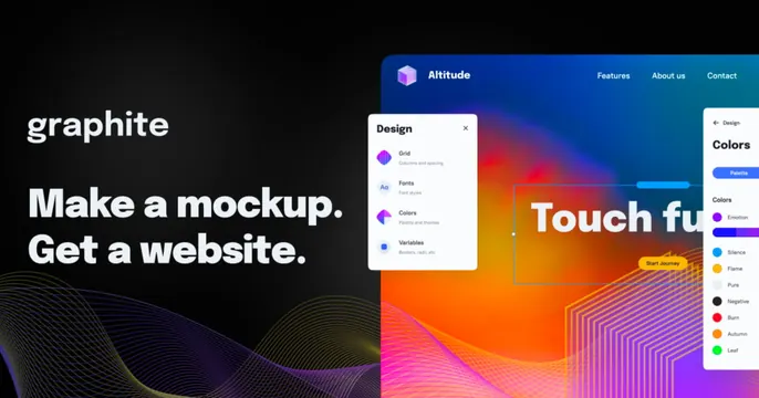
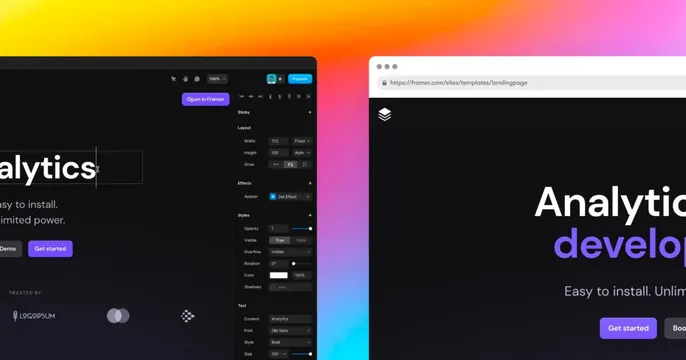
Two dark product UI panels, a Framer canvas and a live site, overlapping a vivid orange-to-pink-to-cyan gradient.
Summary
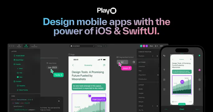
A busy product-forward card: two dark Framer interface panels, the editor with a properties sidebar on the left and a browser-framed published site on the right, overlap a bright warm gradient. It sells the tool by showing the tool building a page.
Visual description
The background is a saturated diagonal gradient running orange to magenta to cyan. Two near-black UI surfaces sit over it: on the left, a Framer canvas showing a selected "Analytics" text element with a full styles/layout properties panel and a violet "Open in Framer" button; on the right, a browser chrome (traffic lights, a framer.com URL bar) framing a published landing page with a large "Analytic / develop" headline, "Easy to install. Unlim..." sub-copy and violet "Get started" buttons. A small "Trusted by" logo row peeks at lower left. Headlines are intentionally cropped at the card edges.
Key takeaway
Showing both the editor and the resulting live page side by side over a hot gradient, so the card communicates "design and ship" in one glance. Letting the UI bleed off all four edges implies a much larger workspace than the frame.
Reuse notes
Best for a website-builder or design-tool product where the interface itself is the selling point. Requires clean, legible UI screenshots and a gradient bright enough to separate the dark panels. The dense detail rewards a large preview but can feel cluttered at thumbnail size.