Preview image. Unlock full-res
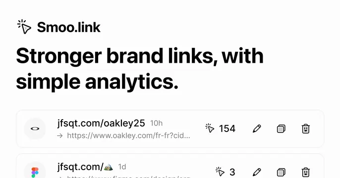
Light product card with a giant black headline over the brand name and a faint preview of a link-analytics list below.
Summary
A clean light card that leads with the brand name and a heavy two-line value-proposition headline, with a softened product UI list teased at the bottom.
Visual description
Near-white background, all content left-aligned and top-anchored. A small cursor/click icon sits beside the bold "Smoo.link" wordmark at top. Below, an oversized black sans-serif headline reads "Stronger brand links, with simple analytics." across two lines. Underneath, rows of a link-management UI begin to appear: a list item showing "jfsqt.com/oakley25" with a destination URL, a timestamp, a click counter ("154") and edit/duplicate/delete icons, with a second row fading off the bottom edge. The lower rows are slightly desaturated so the headline stays dominant.
Key takeaway
Pairing a heavy benefit headline with a genuine product-UI peek at the bottom: it states the value and shows the tool in one glance. The single cursor icon doubles as a logo motif and a hint at the click-tracking premise.
Reuse notes
Good default for a link-shortener or analytics SaaS. The product peek only works if the UI rows are recognizable at small sizes; keep them high-contrast. Pairs with a light brand system.
More like this




Keep what you find
A free account saves references to boards and can send you a weekly email of picks based on what you save.
To see every result, go Pro.