Preview image. Unlock full-res
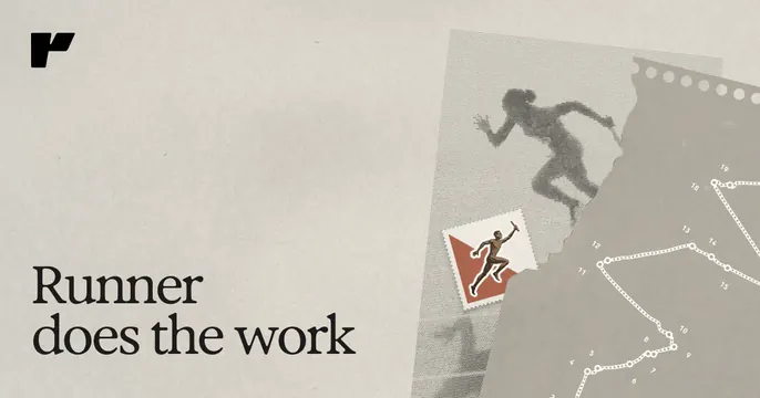
Muted taupe OG card with a serif headline on the left and a grainy monochrome photo of a leaping runner on the right.
Summary
A warm, editorial OG card that splits a quiet serif headline against a grainy duotone photograph of an athlete mid-leap, with a small red illustrated badge as the only accent.
Visual description
Muted warm-taupe background. A small dark "r" logo mark sits top-left; the lower-left carries a two-line serif headline in dark ink reading "Runner does the work". The right half holds a high-grain, desaturated photograph of a runner leaping between rocks, framed almost like film, overlaid with faint dotted constellation lines that connect points across the image. A tiny red-and-white illustrated emblem floats over the runner, the single spot of saturated color on the card.
Key takeaway
The pairing of a restrained serif headline with a gritty, film-grain monochrome action photo gives an editorial, almost magazine feel rare in SaaS. The faint constellation overlay adds texture without clutter, and one red mark keeps the eye anchored.
Reuse notes
Reach for this when a brand wants warmth and craft over the usual bright-gradient SaaS look. Depends on a strong, high-contrast action photograph; the grain and tight crop are doing real work. Pairs well with editorial serif type elsewhere on the site.
More like this







Keep what you find
A free account saves references to boards and can send you a weekly email of picks based on what you save.
To see every result, go Pro.