Preview image. Unlock full-res
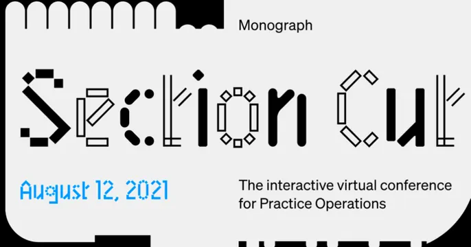
An event card whose title is set in an experimental dot-and-bar display face on a light grey panel with a notched die-cut top edge.
Summary
An event-promo card built around an experimental display typeface, where the "Section Cut" title is constructed from dots, bars, and outlined geometric fragments on a light panel with a scalloped, notched top edge.
Visual description
A pale grey rounded panel sits on a black background, its top edge cut into rounded scallops and notches like a punch-card or architectural section detail. The hero title "Section Cut" runs large across the middle in a custom display face where each glyph is assembled from black squares, rounded bars, hollow rectangles, and diamonds, so the letters read as built rather than drawn. Top-right, small black labels read "Monograph". Lower left, a date "August 12, 2021" appears in a bright blue pixel/dot variant of the same face. Lower right, supporting sans-serif copy reads "The interactive virtual conference for Practice Operations." The bottom edge hints at more cut-out shapes.
Key takeaway
The constructed, modular display lettering as the entire hero, paired with the die-cut scalloped panel edge that ties the typography to an architectural "section cut" concept. One bright blue accent keeps the otherwise black-on-grey scheme from feeling flat.
Reuse notes
Strong for a design-led event, conference, or product launch where an expressive custom typeface signals craft. The novelty face hurts legibility at small sizes, so keep the supporting copy in a clean sans. The notched-edge device pairs well with technical, architectural, or operations-tooling brands.
More like this






Keep what you find
A free account saves references to boards and can send you a weekly email of picks based on what you save.
To see every result, go Pro.