Preview image. Unlock full-res
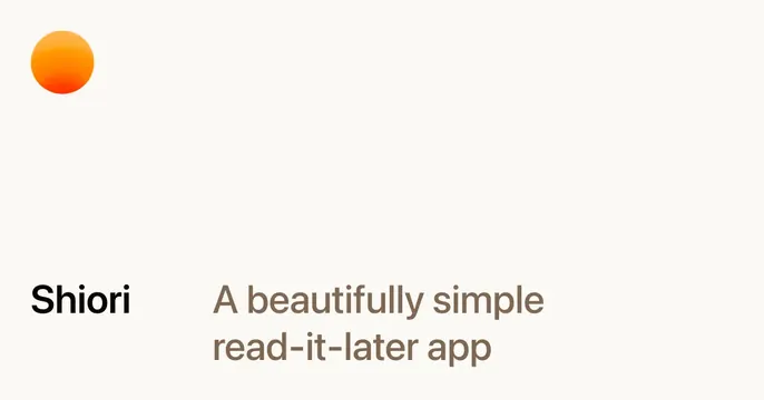
A minimal off-white card with a small orange gradient orb top-left and a left-aligned brand-plus-tagline lockup along the bottom.
Summary
A spare, calm card: a single small orange gradient orb anchors the top-left corner while the brand name and tagline sit in a quiet lockup along the bottom, leaving most of the canvas empty.
Visual description
A warm off-white, almost cream, background dominates with generous empty space. In the upper-left corner sits a small circular orb with a soft orange-to-deeper-orange gradient, the only spot of color and the apparent app icon. Along the lower portion, left-aligned, the bold dark wordmark "Shiori" sits beside a muted brown two-line tagline reading "A beautifully simple read-it-later app". There is nothing else, no imagery, no UI, no buttons. The composition is intentionally understated and breathable.
Key takeaway
The discipline of near-empty space with a single gradient orb as the lone visual accent, and a name-beside-tagline lockup that states exactly what the product is. The restraint itself communicates "beautifully simple", matching the product promise.
Reuse notes
Perfect for a minimal consumer or productivity app whose whole pitch is simplicity and calm. The approach lives or dies on confident spacing and one well-judged accent color; add more and it loses the effect. Works on light grounds; the soft palette would need rethinking on dark.
More like this


Keep what you find
A free account saves references to boards and can send you a weekly email of picks based on what you save.
To see every result, go Pro.