Preview image. Unlock full-res
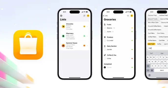
Light app-promo OG card with a yellow shopping-bag app icon beside three iPhone screens of a grocery-list app.
Summary
An app-store-style OG card on a pale background: a rounded yellow shopping-bag app icon on the left, then three iPhone mockups showing a grocery-list app's lists, categories, and search screens.
Visual description
A light off-white background with a faint multicolor gradient streak bleeding in from the bottom-left corner. At far left sits a large rounded-square app icon: a white shopping bag on a yellow-to-orange gradient. To its right, three iPhone frames stand in a row, each carrying the 9:41 status bar and showing the app: a "Lists" overview with grouped grocery lists, a "Groceries" screen organized by Fruits/Produce/Dairy sections, and an add-item screen with the iOS keyboard up. The phones are evenly spaced and uniformly sized. No headline text overlaid.
Key takeaway
The app-store layout convention (icon at left, a fan of real screens at right) instantly communicates "this is a mobile app" with zero copy. The faint corner gradient adds warmth to an otherwise clean white card.
Reuse notes
Default choice for a consumer mobile app launch or feature card. Works only if the screenshots are crisp and show distinct, recognizable screens. The lack of a headline means the icon and UI must carry the message; pair with a strong, colorful app icon.
More like this


Keep what you find
A free account saves references to boards and can send you a weekly email of picks based on what you save.
To see every result, go Pro.