Preview image. Unlock full-res
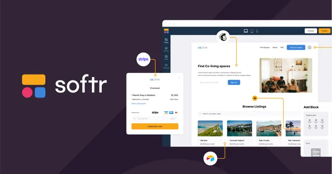
Dark plum OG card with the Softr logo and wordmark on the left and an exploded, connector-linked collage of builder and checkout UI panels on the right.
Summary
A dark plum OG card with a clean Softr logo lockup on the left and an exploded, connector-linked collage of the product's builder, checkout, and listings panels on the right. The wired-together UI fragments show a no-code app being assembled.
Visual description
Deep plum/aubergine background with a faint diagonal facet. Left third: Softr's three-color rounded logo (yellow bar, pink and blue squares) beside the white "softr" wordmark, vertically centered. The right side is a floating, slightly exploded set of product panels connected by thin orange connector lines: a main "Find Co-living spaces" website builder canvas with listing cards, a Stripe-powered "Checkout" modal, a mailchimp icon, an "Add Block" panel, and orange plus-node markers linking them. Bright UI on dark makes the assembly glow.
Key takeaway
Linking separate UI panels with connector lines visualizes "build by connecting blocks" literally, which is perfect for a no-code tool. Floating the panels in space with a slight explode adds depth and implies modularity.
Reuse notes
Ideal for no-code builders, integrations platforms, or anything whose value is composing parts. The connector-diagram needs enough real panels to feel substantial without becoming cluttered; the dark plum base is what makes the colorful UI read as the hero.