Preview image. Unlock full-res
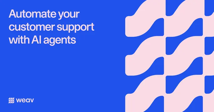
Royal-blue OG card with a pale-pink headline and wordmark on the left and a repeating pink wave-tile pattern filling the right third.
Summary
A clean royal-blue OG card with a soft-pink headline on the left and a repeating pink S-wave pattern on the right. The two-color, pattern-as-decoration approach keeps it calm and on-brand.
Visual description
Background is a flat royal blue. Top-left, a three-line headline in pale pink sans-serif reads "Automate your customer support with AI agents". Bottom-left sits the weav wordmark beside a small woven-grid mark, both in pale pink/white. The right third is filled with a repeating organic pattern: pale-pink interlocking S-curve tiles that ripple in a regular grid, like woven or flowing strands, echoing the brand name. The strict two-color blue-and-pink scheme runs across the whole card.
Key takeaway
A tight duotone (one bold ground color, one soft accent) carried through type, logo, and a name-referencing pattern. The repeating wave tiles fill the right side with brand texture instead of imagery, and they literally nod to "weav".
Reuse notes
Good for brands with a distinctive two-color identity and a name or concept that suggests a pattern. The soft-pink headline on blue is lower contrast than black-on-white, so keep type large. The tiled pattern is a reusable device for filling space without sourcing photography or UI.