Preview image. Unlock full-res
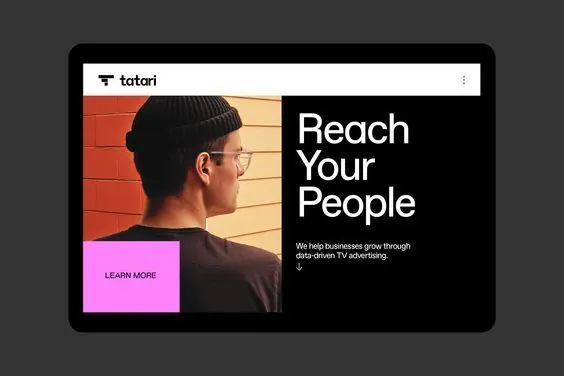
SaaS landing page featuring asymmetric split composition with warm brick pattern, bold white headline, and vibrant magenta CTA button framing a portrait subject.
Summary
SaaS landing page with asymmetric split-screen layout: warm geometric brick pattern and portrait photo on the left, bold oversized headline and supporting copy on the right, anchored by a vibrant magenta button.
Visual description
A device mockup displays a landing page split into two asymmetric halves. Left side: a man in profile wearing glasses against warm brick-pattern tiling in terracotta and peach tones. Right side: the Tatari logo top, oversized white sans-serif headline reading "Reach Your People", one sentence of sub-copy ("We help businesses grow through data-driven TV advertising"), and a vibrant magenta button labeled "LEARN MORE". The layout is unbalanced and dynamic: the portrait anchors the left, while negative space and typography dominate the right. Color story is minimal and controlled: terracotta/peach + black + white + magenta.
Key takeaway
The asymmetric split framing a portrait on one side and headline+CTA on the other; the single pop of saturated color (magenta) as the only interactive element; the oversized sans-serif headline paired with tight, minimal supporting copy. This layout prioritizes clarity over decoration and lets the portrait and color do the framing work.
Reuse notes
Effective for enterprise or B2B SaaS landing pages where a human subject adds trust. Works well when you need a strong directional visual balance (portrait fills left, copy fills right) and one accent color for the CTA. The brick-pattern background is a specific warm detail; the layout principle applies to any portrait + minimal copy combination.
More like this

Keep what you find
A free account saves references to boards and can send you a weekly email of picks based on what you save.
To see every result, go Pro.