Preview image. Unlock full-res
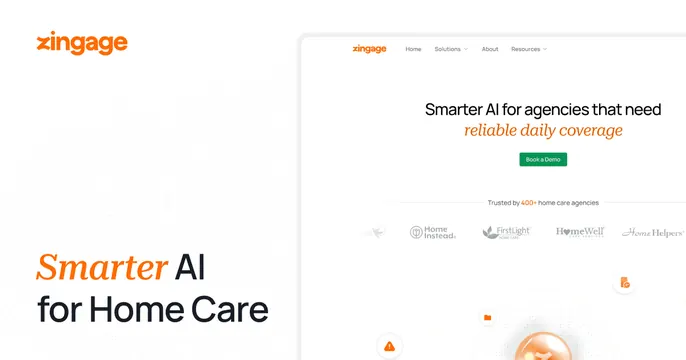
Light OG card with a corner logo and bold serif-italic accent headline beside a website screenshot for a home-care AI product.
Summary
A light split card with a corner logo and a bold headline using an orange serif-italic accent word, beside a screenshot of the brand's own home-care website hero.
Visual description
White background with a faint dotted texture on the left. Top-left holds the orange "zingage" wordmark; bottom-left carries a large headline "Smarter AI for Home Care" where "Smarter" is set in an orange serif italic and the rest in black sans-serif. The right two-thirds shows a screenshot of the live site: a nav bar, a hero reading "Smarter AI for agencies that need reliable daily coverage" with a green "Book a Demo" button, a "Trusted by 400+ home care agencies" logo row, and floating file and alert icons over a soft orbit graphic at the bottom.
Key takeaway
Mixing a serif italic accent word into a sans headline to add editorial warmth to a tech product. Using the brand's actual homepage as the right-side visual keeps the card and site consistent.
Reuse notes
Good for a vertical-AI or services SaaS that wants a human, trustworthy tone. The screenshot is detailed, so the corner headline must carry the message at thumbnail size. Suits light, warm-accent brands.