Preview image. Unlock full-res
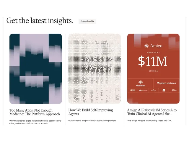
Light blog-list section with a serif headline and three equal cards mixing abstract art, halftone texture, and a funding announcement graphic.
Summary
A restrained insights section pairing a large serif headline with three blog cards, each using a distinct abstract visual treatment above title and excerpt copy.
Visual description
Off-white page with a thin warm border framing the section. Top row splits left and right: a large serif headline reads "Get the latest insights." opposite a small rounded "Explore Insights" pill button in light gray. Below, three equal-width cards sit in a horizontal row with generous gutters. Each card has a rounded-corner image area and stacked title plus muted gray excerpt. The left card shows teal and lavender vertical blocks with brushed edges. The center card is a cream halftone dot field fading toward the right. The right card is a solid terracotta announcement panel with white Amigo wordmark, "ANNOUNCES $11M SERIES A" in oversized serif, and a grid of investor logos along the bottom. Card titles use serif; body lines use small sans-serif.
Key takeaway
Let each card image carry a different visual language (abstract color blocks, texture, announcement graphic) while the typography and spacing stay identical. The oversized funding graphic inside a blog card slot turns a press item into a peer of editorial posts without breaking the grid.
Reuse notes
Strong for healthcare or AI companies publishing thought leadership alongside company news. Needs strong art direction per post; the grid only works if every thumbnail feels intentional. Pairs well with a minimal serif headline and a quiet secondary CTA above the list.