Preview image. Unlock full-res
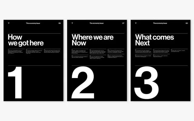
Three numbered magazine covers for MIT Technology Review designed by Pentagram, featuring bold white type on black backgrounds with structured grid layouts.
Summary
Three magazine covers for MIT Technology Review designed by Pentagram, arranged in a sequential display. Each black cover features a bold white numeral (1, 2, 3) anchoring the composition, with a headline above describing the issue's theme.
Visual description
Three covers stacked horizontally, each with a black background and white typography. At the top of each spread sits "The economy issue" with a corresponding page number (09, 27, 63). Below is a white sans-serif headline in large display type: "How we got here" (cover 1), "Where we are Now" (cover 2), and "What comes Next" (cover 3). Each headline is followed by several lines of smaller body copy arranged in a hierarchical grid. The dominant visual element is the oversized numeral (1, 2, 3) occupying the lower half of each cover, set in a condensed sans-serif typeface. Horizontal dividing lines separate sections, creating a structured, modular layout.
Key takeaway
The power of sequence and numbering as an organizational principle, combined with typographic hierarchy. The bold numerals are both visual anchors and functional content indicators, while the consistent grid structure across all three covers creates visual cohesion without decoration or imagery.
Reuse notes
Excellent reference for editorial design, magazine cover design, and systems thinking. The approach works well for multi-part narratives, issue-based publications, or content organized into clear sequential steps. The black-and-white palette ensures high contrast and print clarity; this approach pairs well with photography or color imagery used elsewhere in the publication.
More like this






Keep what you find
A free account saves references to boards and can send you a weekly email of picks based on what you save.
To see every result, go Pro.