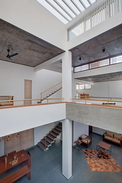
Preview image. Unlock full-res
Muted composition dominated by warm taupe-gray with subtle dark charcoal and rust-brown accents, earthy and sophisticated.
Summary
A warm, earthy composition built on warm gray-taupe as the foundation, with charcoal depth and rust-brown notes creating subtle tonal variation without jarring contrast.
Visual description
Warm gray-taupe (#969394) dominates at 81%, establishing a soft, approachable neutral base. Dark charcoal (#34343B) adds roughly 12% depth, likely forming shadows or secondary shapes. Rust-brown (#593832) appears as a tiny accent at 3%, providing an earthy warmth that prevents the palette from feeling cold. A whisper of near-white (#E3E4E8) rounds out the palette at 1.6%. This is tonal harmony rather than contrast—each color flows into the next.
Key takeaway
The power of warm neutrals working in harmony rather than opposition. Rust and charcoal add richness without shouting; the soft taupe base keeps everything grounded and approachable.
Reuse notes
Excellent for hospitality, wellness, luxury lifestyle, or heritage/craft brands. Works beautifully in editorial contexts and interiors. The warmth prevents a corporate-cold feel. Pairs naturally with serif and geometric typefaces. Strong for packaging and physical materials where tactile warmth matters.
More like this



Keep what you find
A free account saves references to boards and can send you a weekly email of picks based on what you save.
To see every result, go Pro.