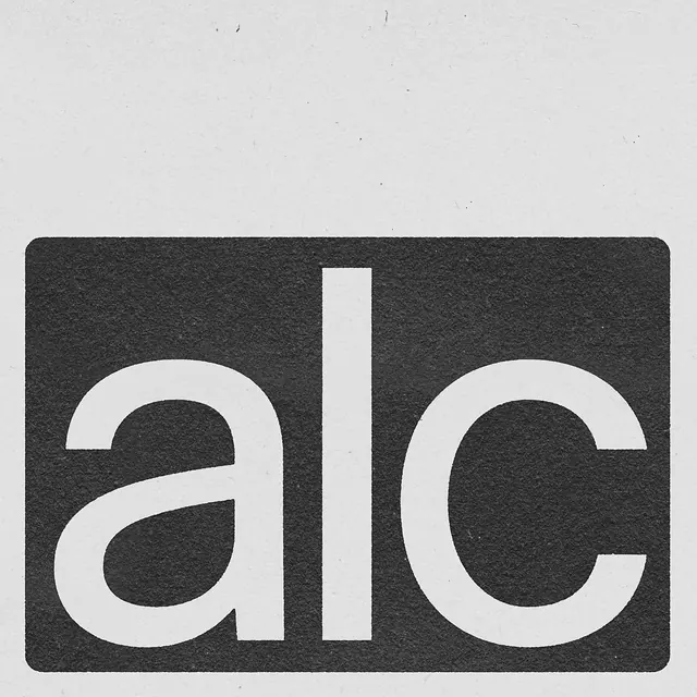
Preview image. Unlock full-res
Bold lowercase wordmark reading alc in white cutout type on a textured charcoal card against a light gray background.

Summary
A lowercase wordmark reading "alc" cut out in white from a dark, textured rectangular card, shown centered on a light gray backdrop.
Visual description
A dark charcoal-gray rectangular card with rounded corners and a visibly grainy, textured surface sits in the lower two-thirds of the frame against a plain light gray background. The card carries a bold lowercase wordmark, "alc," rendered as negative space (the letterforms are the color of the background showing through, not printed ink) in a rounded geometric sans-serif. The "l" is drawn as a simple vertical bar rather than a conventional lowercase l, giving the mark a more abstract, blocky rhythm. The composition is otherwise empty, with generous negative space above the card.
Key takeaway
Using negative-space cutout lettering on a textured, tactile card material gives a simple three-letter wordmark a tangible, crafted feel rather than reading as a flat digital logo.
Reuse notes
Useful reference for brand identity presentations, business card or stationery mockups, or logo reveal layouts that want to emphasize print texture and materiality. The trick relies on strong contrast between the card's dark surface and the light backdrop; would not read well on a busy background.
More like this


Keep what you find
A free account saves references to boards and can send you a weekly email of picks based on what you save.
To see every result, go Pro.