Preview image. Unlock full-res
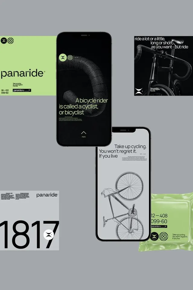
Cycling app onboarding across desktop and mobile, using lime-green accents and high-contrast photography against dark type-focused layouts.
Summary
A multi-screen cycling app onboarding system mixing lime-green branded accents, bold sans-serif headlines, product photography, and high-contrast typography on dark and light grounds.
Visual description
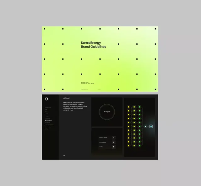
The composition shows a desktop sign-up panel (left, lime-green background with wordmark), mobile onboarding sequence (center, dark screens with large white type), and product photography hero (right, lifestyle bike close-up). Desktop panel uses stacked layout: small logo pair, horizontal rules, large headline "panaride" in sans-serif, functional copy, and date notation (08-015 / 009-60) suggesting system versioning. Mobile screens feature dense dark backgrounds with large, centered white text and subtle accent color; the flow escalates from headline definition ("A bicycle rider is called a cyclist, or bicyclist") through motivational copy ("Take up cycling. You won't regret it") to photography. Bottom left shows a large display number (1817) and brand identity lock-up. Top right photography crops a bike in dramatic black and white, anchored by lime-green system icons.
Key takeaway
The disciplined use of one accent color (lime-green) applied as buttons, icons, and small panels to break black/gray/white. The typography hierarchy: display-weight sans-serif headlines sized at 36-48px paired with micro copy and body copy in a smaller size, creating clear cognitive levels. The responsive mockup layout (desktop left, mobile center, asset right) as a portfolio composition.
Reuse notes
Strong template for a mobile-first app launch site or onboarding flow, especially for a technical or fitness/lifestyle vertical. The single accent color keeps it modern without overdesign. Dark screens read well for mobile but require confident photography to carry the right side; light would broaden accessibility.