Preview image. Unlock full-res
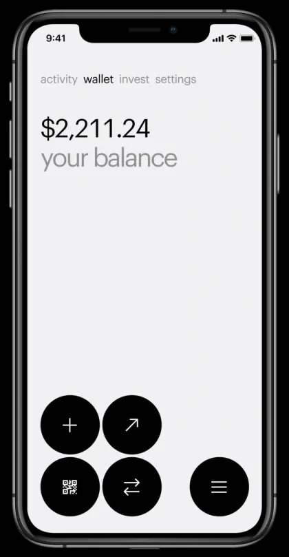
Minimalist banking screen centered on a single large balance figure, with a grid of black circular icon buttons for core actions: send, receive, QR code, and menu.
Summary
A minimalist fintech app screen with a dominant balance amount centered above the fold, and a grid of five black circular buttons providing send, receive, QR scan, swap, and menu actions.
Visual description
A light gray and white background with top navigation showing "activity wallet invest settings" tabs in gray. Large black dollar figure "$2,211.24" is displayed with subtext "your balance" in lighter gray below. The lower half holds a grid of five black circles on a white background: four buttons arranged in a 2x2 grid (plus icon, diagonal arrow, QR code icon, swap icon) with a fifth larger circle containing a hamburger menu icon to the right. All icons are white outlines on black. System chrome (status bar, notch, bezels) visible. No gradients, images, or texture.
Key takeaway
The extreme whitespace around the primary data (the balance) makes the interface feel calm and focused. Circular black buttons with white icons create a strong visual anchor at the bottom without feeling button-heavy. The tab navigation sits lightly at the top in muted gray, not competing with the balance display. This hierarchy clearly says: "Here is your money. Here is what you can do."
Reuse notes
Ideal for fintech or payments products prioritizing trust and clarity over visual flair. Works especially well for wallet, banking, or crypto apps where the user's account balance or holdings are the hero. The monochrome treatment signals security. Avoid if you need visual warmth or brand color emphasis.