Preview image. Unlock full-res
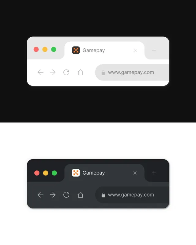
Dual-theme browser address bar mockup showing light and dark treatments of a minimalist navigation UI with rounded corners and soft shadows.
Summary
A side-by-side comparison of light and dark variants of a browser address bar component, emphasizing clean minimal design with soft rounded corners and subtle drop shadows.
Visual description
The image shows two identical browser chrome mockups stacked vertically: a light variant at top on dark background, and a dark variant below. Each features a soft-rounded container with red, yellow, and green window control dots in the top-left corner, the Gamepay brand icon and text in the center, and an X close button plus add-tab button on the right. Below sits a secondary bar with left/right navigation arrows, refresh icon, home icon, and a soft-rounded address bar showing "www.gamepay.com" with a lock icon. Typography is clean sans-serif in neutral grays. Shadows are subtle, adding depth without visual clutter.
Key takeaway
The soft-rounded glass treatment of the address bar and the symmetrical layout of navigation controls. The paired light/dark mockup showing the same component's behavior across themes in one frame, making design consistency immediately visible. The restrained color palette (only traffic lights + brand + neutrals) keeps focus on the interaction structure.
Reuse notes
Strong reference for any browser extension, developer tool, or web app that needs to show native chrome UI or mock browser interactions. The light/dark pairing is useful when designing for systems that support theme switching. Works well in case studies or product walkthroughs where you need to demonstrate UI consistency.