Preview image. Unlock full-res
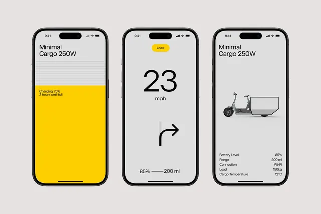
EV cargo management app screens showing three information-dense dashboards: charging status, vehicle speed, and cargo metrics on a minimal monochrome base with bold yellow accent.
Summary
Three stacked mobile screens for an EV cargo app showing charging, speed/range, and vehicle status, unified by a stark black-and-white typographic layout with a solid yellow band conveying active status.
Visual description
Left screen displays "Minimal Cargo 250W" as a header above horizontal rules, then a bold yellow band with "Charging 75% 2 hours until full" in black sans-serif. Center screen shows a large "23 mph" in heavy display type, a curved arrow pointing right, and fine-print range data "85% - 200 mi" below. Right screen repeats the header, then a simple illustrated side-view of a small electric cargo vehicle, with a stats column listing Battery Level (85%), Range (200 mi), Connection (Wi-Fi), Load (150kg), and Cargo Temperature (12 C) in smaller sans-serif. All three screens share the bezel and status bar of a modern smartphone frame.
Key takeaway
The color hierarchy through a single accent color (yellow) applied as a full-width band to highlight critical state information rather than sprinkled highlights. The precise, left-aligned typographic scale that keeps data readable without visual noise. The icon illustration style - minimal line-work and geometric shapes that reinforce the utilitarian, logistics-focused aesthetic.
Reuse notes
Strong for fleet management, delivery, or logistics apps where you need to surface key metrics (battery, range, load) in a compact space. The yellow-on-white works well for warning or active status states. Works at small viewport sizes because it strips color and decoration. Less suitable for consumer apps needing warmth or play; the sterile grid and data density read industrial.