Preview image. Unlock full-res
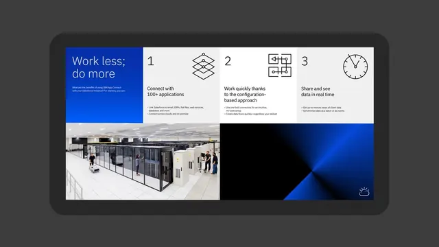
Split layout: left panel with bright blue background and white headline 'Work less; do more'; right three-column card grid with icons, captions, and data-center photography below.
Summary
IBM App Connect feature overview dividing a rich blue left panel with headline and tagline from a three-column card grid (numbered 1-3) explaining benefits, anchored by a photograph of a server room.
Visual description
The left third features a solid bright blue background with white sans-serif headline "Work less; do more" and supporting copy explaining IBM App Connect benefits (integrating Salesforce, cloud, on-premise systems). The right two-thirds split into three numbered cards in white: each shows an outlined icon, a bold headline, and multi-line supporting text. The three benefits are connectivity (100+ applications), quick configuration (no-code setup), and real-time data sharing. Below spans a photograph of a server room with people and equipment, which sits above a dark blue geometric shape with a weather icon in the lower right corner.
Key takeaway
The contrast between the solid color statement panel and the information card grid creates visual interest and legibility. The photography grounds the abstract software concept in tangible infrastructure. Numbered steps with icons clarify abstract benefits. White on dark blue maintains WCAG contrast while feeling modern.
Reuse notes
Ideal for B2B/SaaS platforms explaining integration or connectivity. The photography humanizes technical features. Best used in desktop contexts where the split layout has room to breathe. Avoid on mobile where stacking becomes vertical noise.