Preview image. Unlock full-res
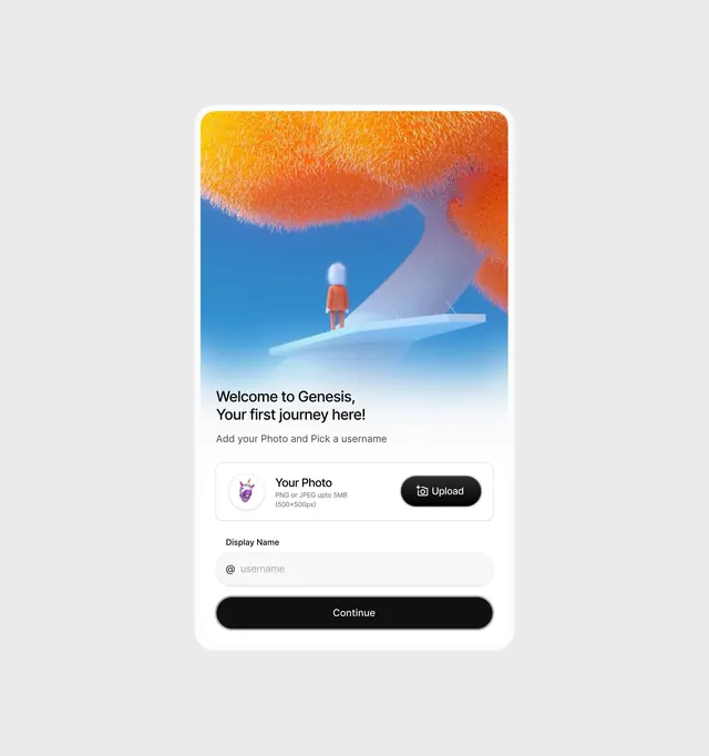
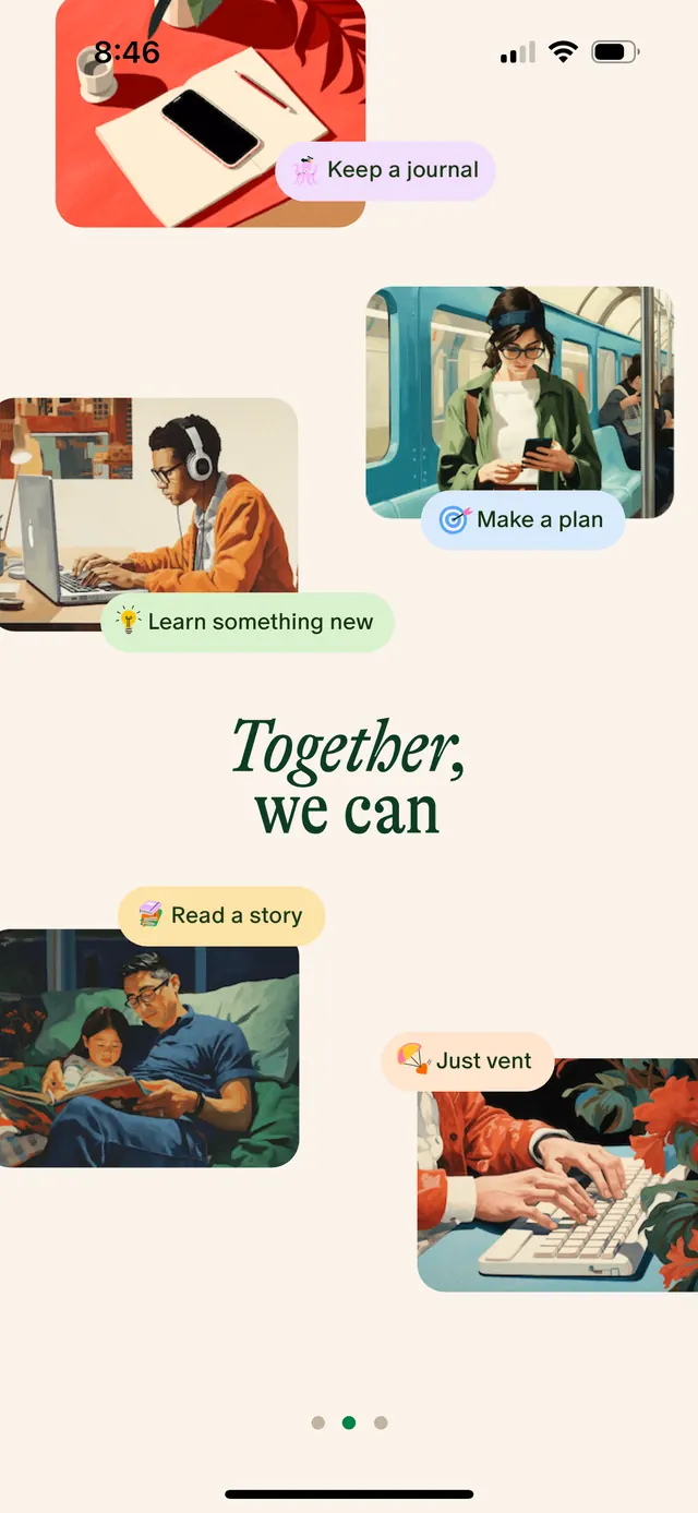
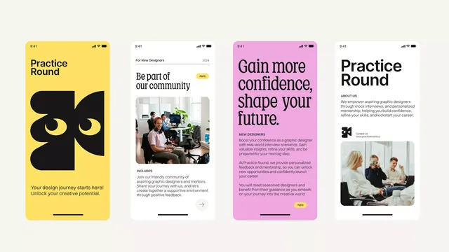
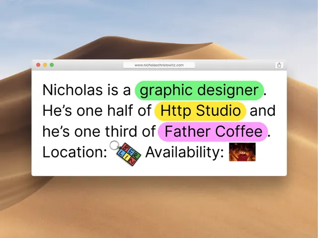
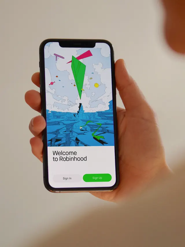
Mobile app onboarding screen with a hand-drawn illustration of a parachute over a river landscape, welcoming users with a green call-to-action button.
Summary
Mobile app onboarding screen with a hand-drawn illustration of a parachute over a river landscape, welcoming users with a green call-to-action button.
Visual description
A phone viewport filled with a digital landscape illustration. Top half shows a light blue sky with a pink-and-green parachute descending toward a teal river below. The landscape includes rolling hills and geometric water patterns in muted blues and teals. A dark blue app header bar sits at the top with status icons. Below the illustration, on a white background, sits the text "Welcome to Riverhood" and a larger green rounded-rectangle button labeled "Sign in". The parachute carries warm pink tones; the water and sky use cool blues and teals. All typography is clean, modern sans-serif in dark gray or black, with generous whitespace below the illustration and button.
Key takeaway
The illustration fills the screen without dominating the navigation—the actual UI stays lightweight below. The color palette (warm accent parachute against cool water and sky) creates visual interest while maintaining calmness. Hand-drawn organic shapes (the landscape) paired with geometric app chrome conveys both personality and clarity. The whitespace separation between illustration and interaction affordances prevents visual clutter.
Reuse notes
Effective for lifestyle or consumer apps that benefit from a welcoming, serene first impression. The illustration-heavy approach works best when the visual metaphor is directly relevant to the app's purpose or brand identity. Reserve this pattern for onboarding or key moments; full-screen illustrations can reduce usable space on small devices, so pair with concise microcopy. The warm/cool color contrast pairs well with earth-toned branding.