Preview image. Unlock full-res
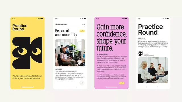
Four vertical app cards (phone mockups) in a carousel layout featuring bold solid-color backgrounds (yellow, off-white, magenta, gray) and a serif/sans-serif typography mix promoting a creative community platform.
Summary
A horizontal carousel of four card-sized mobile screen mockups, each on a vibrant solid background (yellow, beige, magenta, pale gray) promoting features of a creative community app called "Practice Round."
Visual description
Four vertical mobile phone mockups arranged left-to-right. Card 1 (yellow background): "Practice Round" serif headline with an abstract black geometric logo, call-to-action tagline, and yellow-to-white gradient fill in the phone. Card 2 (off-white background): "Be part of our community" with a photograph of two people collaborating in an office setting, descriptive text in sans-serif. Card 3 (magenta/hot-pink background): "Gain more confidence, shape your future" serif headline in white, small sans-serif supporting text, photograph of professional figures. Card 4 (pale gray/taupe background): "Practice Round" with a photograph of people in a work setting, small text callout. Each phone screen shows status bar, minimal navigation. Flat card presentation, no shadow or depth, high color contrast between backgrounds and phone content.
Key takeaway
The solid-background card approach makes each feature instantly scannable and printable. Color variety (four different backgrounds) avoids monotony in a carousel. Serif-sans pairing (serif for headlines, sans for body) establishes hierarchy and feels premium. Photography inside the phone frames adds human warmth, proving the app's social angle.
Reuse notes
Excellent for community, creative, or social SaaS apps with multiple distinct features to showcase. The carousel format suits horizontal spaces (hero section, features row). Each card is self-contained, so missing or removing a card doesn't break the layout. Works on desktop; test responsive behavior to ensure cards stack/scroll gracefully on mobile. Swap colors to match brand identity; the strong contrast between background and phone content is key to readability.