Preview image. Unlock full-res
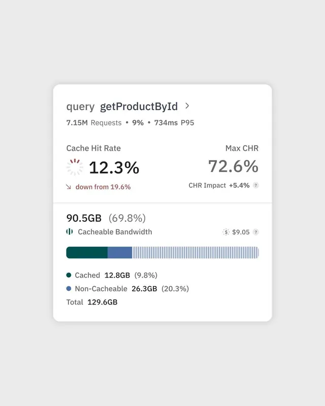
Backend performance dashboard displaying query metrics, cache rates, and bandwidth allocation via a stacked bar chart and tabular data.
Summary
Backend performance dashboard displaying query metrics, cache rates, and bandwidth allocation via a stacked bar chart and tabular data.
Visual description
A white rounded card on a light gray background contains a technical performance view. Header shows "query getProductById" with chevron, followed by key metrics: "7.15M Requests", "9%", "734ms P95". Below, two columns: left column shows "Cache Hit Rate" with a large "12.3%" and red-down arrow indicator "down from 19.6%"; right column shows "Max CHR" with "72.6%" and "CHR Impact +5.4%" with an info icon. Below the metrics, a second section displays "90.5GB (69.8%)" as a heading with icon, labeled "Cacheable Bandwidth" and price "$9.05". A horizontal stacked bar chart follows, using dark teal, muted blue, and light gray stripes, with a legend below showing "Cached 12.8GB (9.8%)", "Non-Cacheable 26.3GB (20.3%)", and "Total 129.6GB".
Key takeaway
The hierarchy separates key metrics (top) from detailed data visualization (bottom), making the most important numbers scannable at a glance. The color-coded stacked bar chart (teal + blue + gray) makes data relationships immediately clear. Small icons and helper text (like the down-arrow on the cache metric) provide context without clutter.
Reuse notes
Perfect for backend monitoring, infrastructure dashboards, or developer-facing performance tools. Use when you need to show both aggregate stats and detailed breakdowns. The neutral, muted color palette keeps focus on data rather than decoration. This pattern works for API metrics, resource allocation, or any scenario requiring compact metric display with drilling-down capability.