Preview image. Unlock full-res
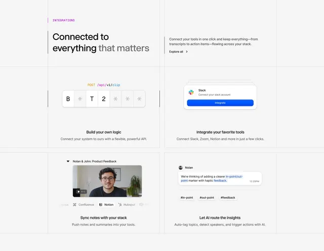
SaaS dashboard showing API documentation, integration cards, and team feedback with a purple accent bar and modular card-based layout.
Summary
Developer-focused SaaS dashboard featuring API integration guides, modular feature cards, an embedded team feedback video, and a Slack integration prompt with purple accent bar.
Visual description
Full-width white dashboard with left border accent in vibrant purple. Header: large sans-serif headline "Connected to everything that matters" in black and gray, with supporting copy and "Explore all" link. Below: two columns of modular cards. Left column: code block showing "POST /api/v1/clip" endpoint with letter/number placeholders, "Build your own logic" section with API description, and a product-feedback video embedded showing a team member discussing in-point/out-point feedback with mention of Confluence, Notion, HubSpot integration icons at bottom. Right column: "Integrate your favorite tools" header with Slack integration card (blue Integrate button, Slack logo), and "Let AI route the insights" section describing auto-tagging and action triggers. Bottom right: tag pill buttons (#in-point #out-point #feedback).
Key takeaway
The purple left border as a single-element accent that unifies disparate content without heavy frames. The modular card grid mixing text, code, video, and CTAs without feeling busy. API code display embedded naturally alongside feature descriptions rather than isolated. The color-coded status tags and hashtag treatment for quick semantic scanning.
Reuse notes
Ideal for developer tools, API platforms, and integration marketplaces. The minimal palette (white, grays, one vibrant accent) reads professional and stays readable at smaller viewport sizes. The video embed adds credibility; use when you have a strong product demo or team testimonial. Avoid overloading cards; the strength here is breathing room and clear sectioning.